Making fine prints in your digital darkroom
Image editing: an introduction
by Norman Koren
|
|
|
In this page we introduce the heart of the digital printmaking process: image editing-- the art of turning raw images into fine prints. We go into greater depth in the series, Image editing with Picture Window Pro.
Image editing is the heart of the creative act of photographic printmaking-- it is where you transform a well-crafted snapshot into a work of art. It is where you implement Ansel Adams' oft-repeated statement,
"The negative is comparable to the composer's score and the print to its performance."One reason you need to edit is that a print can rarely capture the tonal range of an actual scene, particularly a naturally illuminated landscape. A print has a maximum tonal range of no more than 100:1. Scenes have widely varying tonal ranges, often much greater. If you try to transfer a scene literally to a print, the contrast may be too low, resulting in a flat appearance. More often it's too high, blocking out highlights and shadows.
Our eyes function differently when viewing prints and viewing scenes. As they move about a scene, they constantly adapt to differences in illumination using all sorts of cues not present in a print. The scene we experience is the result of numerous small and large adaptations. When we look at a print, our eyes adapt very little. They grasp the print as a whole. In order to capture the feeling of a scene, those adaptations have to be put into the print. You accomplish this by editing selected portions of the print.
Some of the specific goals of image editing are,
|
| Light and color and Color space have moved to a new page, Light and Color: an introduction. |
I will illustrate image editing with a few of my favorite tools and transformations from Picture Window. Many more are available. You can go into more depth in Digital Light & Color's Tutorials and White Papers. and in Image editing with Picture Window Pro.
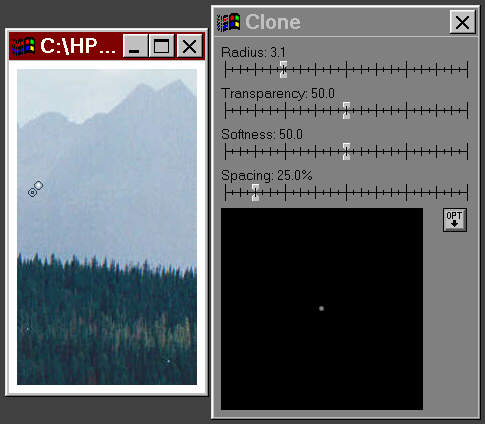 The
first operation I perform on a newly scanned image is dust removal. No
matter how carefully I clean negatives or slides, some dust spots always
remain. They are white on negatives and black on slides. I use the Clone
tool
The
first operation I perform on a newly scanned image is dust removal. No
matter how carefully I clean negatives or slides, some dust spots always
remain. They are white on negatives and black on slides. I use the Clone
tool A small portion of the image is illustrated to the left of the clone
box; I usually enlarge it to 1:1 magnification (1 image pixel = 1 screen
pixel) and have it fill the screen. The clone operation copies the contents
of the lower left circle to the upper right circle, where the cursor (not
shown) is pointed and the spot is located. You have complete freedom to
select where to copy from and to. One of the reasons I remove spots first
is that they distort the brightness histogram, shown below. Several
scanners
have infrared dust removal, which
eliminates most dust specks in color films, but doesn't work with Kodachrome
or B&W film. Picture Window also offers a Speck Removal tool ![]() .
I don't use it as often as clone because it tends to soften the image where
it is applied, but sometimes it helps in tight spots.
.
I don't use it as often as clone because it tends to soften the image where
it is applied, but sometimes it helps in tight spots.
Polaroid has an excellent Dust & Scratch Removal Utility, which operates at a standalone program or as a Photoshop plug-in. It's a big time saver for cleaning up dirty images with lots of scratches and dust specks. You can download it for free. You'll see an intimidating questionnaire that asks for your scanner model and serial number. You don't need to answer.
When the image is enlarged 1:1 for dust removal, you may notice color fringing (a frequent problem with extreme wide angle and telephoto lenses) near the edges of the frame. You should remove it now, before you perform major color transformations, sharpening or masking.
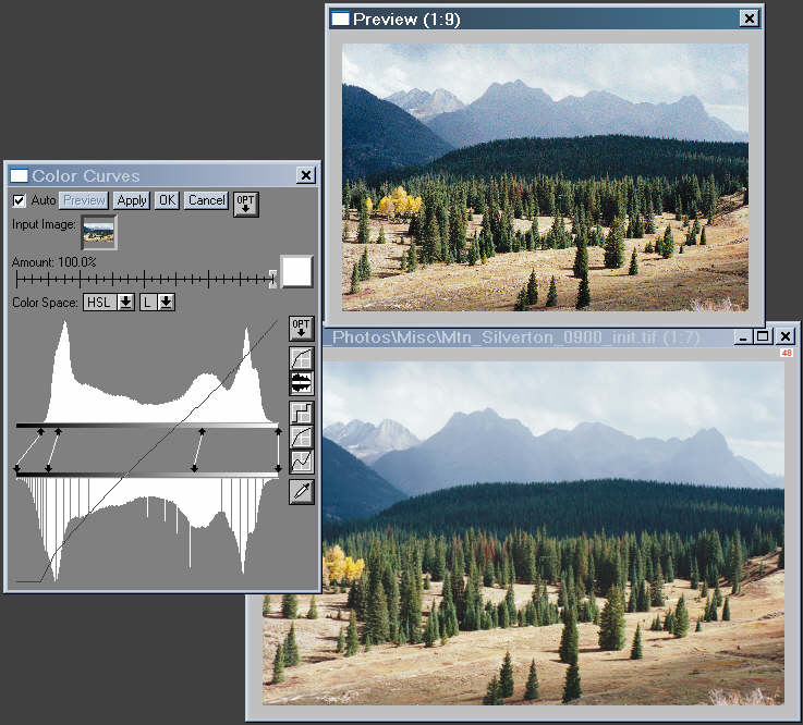
Click on the input image, then click on Transformation,Color,
Curves...
This brings up the
Color Curves dialog
box, illustrated below. Click on the Show Histograms icon![]() ,
to bring up the display shown below in the Color
Curves dialog box. I find this display most useful for making adjustments.
Shift-click on the upper histogram bar to add control lines. They can be
removed by control-clicking. Move either end to control tonality. Set Color
Space: to HSL and make sure
the L channel is selected.
,
to bring up the display shown below in the Color
Curves dialog box. I find this display most useful for making adjustments.
Shift-click on the upper histogram bar to add control lines. They can be
removed by control-clicking. Move either end to control tonality. Set Color
Space: to HSL and make sure
the L channel is selected.
I chose HSL color space (HSV is the default) because I'm darkening most of the image, and HSL increases saturation when the image is darkened. I prefer it for most (but not all!) transformations because it represents visual changes in prints during darkening and lightening better than HSV most of the time: maximum L is pure white. You'll notice that some of the densities in the lower histogram are missing or doubled up. This is the result of compressing and expanding tonalities with the 256 levels in the Preview image. This effect can cause loss of fine details when you do repeated editing on 24-bit (3 colors x 8 bit depth) color files, but no detail is lost with 48 bit (3 x 16) color files.
The input image is on the lower right and the Preview image is on the upper right. The difference here isn't dramatic, though it often can be. The upper and lower histograms correspond to the input and output images. If Auto is checked, the Preview image is refreshed whenever you shift tones by moving an end of a control line.
Picture Window's histogram is much more accurate than the HP PhotoSmart S20 scanner histogram in Part 2, which is derived from the low resolution preview scan and apparently contains tones from the edges of the frame and includes sharpening artifacts. Fortunately you can determine scan densities by pointing to portions of adjustment screen image with the cursor.
To obtain deep black tones I bring down the black level by just the right amount (control line on the left), then I boost contrast in the deep shadow region. I continue to make adjustments until the Preview image has the appearance I want. Then I click OK. A screen with the new image named "Untitled n" (n a number) appears. The old image remains. I can choose between overwriting the old image, saving the new image in a new file, or doing further editing before I save it. It's always wise to save your work frequently, particularly if you use Windows 95, 98 or ME.
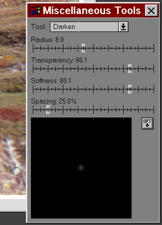 My
next step was to darken the sunlit bushes on the lower right. They are
a distraction whose brightness draws the eye away from the main flow of
the image. I used the Darken tool (one
of the Miscellaneous tools
My
next step was to darken the sunlit bushes on the lower right. They are
a distraction whose brightness draws the eye away from the main flow of
the image. I used the Darken tool (one
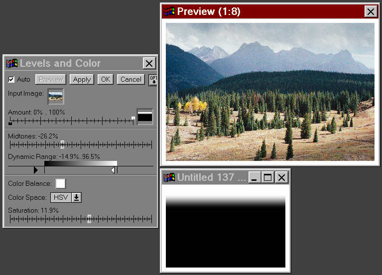
of the Miscellaneous toolsThe clouds are a little lighter and less ominous than I remember them. So I darkened them using the Levels and Color transformation with the Gradient mask, which is the simplest mask available in Picture Window. A mask is a monochrome image used to apply transformations to selected areas of another image with the same pixel dimensions. You can use masks to dodge, burn, sharpen or alter contrast and color in portions of an image. Picture Window has powerful mask making and editing capabilities, including the abilities to create a mask based on image color or brightness.
The gradient mask consists of a simple shape with gradual boundaries. As illustrated below to the right, most of the mask is black, but it gradually becomes white near the top. The window to the right of the Amount bar selects the mask. (it's blank when no mask is selected.) The Amount bar indicates how strongly the mask affects the image. Image areas corresponding to black on the mask will be unaffected by the transformation. (The black pointer is at 0%.) Areas corresponding to white on the mask will be transformed 100%. (That's the default; you can change it if you wish.) Gray areas will be in between.
The Levels and Color transformation is my favorite for dodging, burning, color balancing, and saturation control because it does so much. Since I planned to darken some very light areas of the sky, I chose HSV color space. Those areas take on an unnatural cast when darkened with HSL. To recover some of the saturation lost when darkening with HSV, I increased Saturation by 11.9%. I darkened Mid tones by -26.2% and I also darkened the highlights and shadows, shown under Dynamic Range. I didn't change the color balance. I illustrate the Preview image but omit the input image to save Web page space.
 You
must apply the Sharpening Transformation to get sharpest possible image.
The technical details of sharpening are discussed in Understanding
image sharpness part 2. In essence, sharpening restores some of the
detail softened by the film, lens and scanner. But it can't restore detail
that isn't present.
You
must apply the Sharpening Transformation to get sharpest possible image.
The technical details of sharpening are discussed in Understanding
image sharpness part 2. In essence, sharpening restores some of the
detail softened by the film, lens and scanner. But it can't restore detail
that isn't present.
Before you sharpen the image, you'll want to set the magnification to
1:1![]() .
This allows you observe the sharpness and grain of the original image.
Then click on Transformation,
Sharpen...
The Sharpen control box and preview window, shown on the right, appears.
Set the magnification of the Preview window to 1:1 and resize it larger
than the smallish default. This allows you to observe the precise effects
of sharpening. It should be obvious that it improves the image sharpness--
it almost always does. It will also exaggerate dust and scratches and it
will increase grain if any is present.
.
This allows you observe the sharpness and grain of the original image.
Then click on Transformation,
Sharpen...
The Sharpen control box and preview window, shown on the right, appears.
Set the magnification of the Preview window to 1:1 and resize it larger
than the smallish default. This allows you to observe the precise effects
of sharpening. It should be obvious that it improves the image sharpness--
it almost always does. It will also exaggerate dust and scratches and it
will increase grain if any is present.
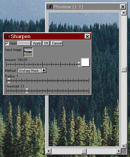
Next, set Method to Unsharp Mask (it defaults to a simple Sharpen operation). Unsharp Mask gives you much more control-- it allows you to set Radius and Threshold in addition to Amount.
The degree of sharpening is set by Amount. Move the slider from its default of 100% to see what it does. Setting it too high can result in exaggerated edge contrast in images that are sharp to begin with. Avoid oversharpening.
Next, try out Radius. The softer the image, the larger you'll want to set it. I set Radius to 1 for sharp images scanned at 2400 dpi. For 4000 dpi scans, where the limits of image sharpness are much more apparent, I often set Radius to 2; occasionally 3.
The Threshold setting is the big advantage of the Unsharp Mask method: It allows a decision to be made in the sharpening process: Sharpening is performed only if neighboring pixels differ by more than the Threshold setting. This is important because Sharpening has a side effect: it exaggerates grain, which can be objectionable in smooth areas like skies. It's quite noticeable in the preview window on the right. Increasing Threshold reduces the grain exaggeration, but it also reduces the effectiveness of sharpening-- it's a tradeoff.
You'll have to take a good look at the preview window, scrolling it to different portions of the image, trying out different settings, to see what works best. I often create a mask to remove smooth areas (skies, etc.) from the Sharpening operation so I can sharpen more strongly where it's needed. For this image I chose Amount: 100%, Radius: 1, and Threshold: 13.
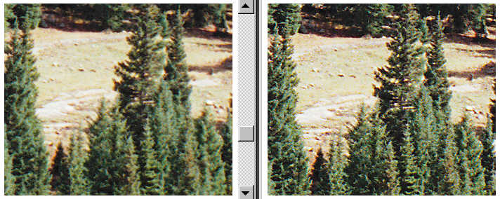
Since sharpening exaggerates small defects, I did some additional spot removal using the Clone or Speck Removal tools. The results are quite striking: the same portions of the unsharpened and sharpened images at 1:1 magnification are shown on the left and right, below.
You can learn more about sharpening in Understanding image sharpness part 2.

| Images and text copyright (C) 2000-2013 by Norman Koren. Norman Koren lives in Boulder, Colorado, where he worked in developing magnetic recording technology for high capacity data storage systems until 2001. Since 2003 most of his time has been devoted to the development of Imatest. He has been involved with photography since 1964. |  |