Making
fine prints in your digital darkroom
Black
& white
by
Norman
Koren
updated Feb. 15,
2005

Black
and White
Although I've focused on color, the techniques I've presented work
equally
well for B&W. There is less difference between color and B&W
work
on the computer than in the traditional darkroom. The main differences
are,
- Scans are done in B&W mode. The HP scanner is set for B&W
negatives before
negatives are inserted. Color negatives or slides are scanned in color,
then converted to B&W using the technique below.
- The scanned file is saved as a 16-bit B&W TIFF (the same bit
depth
as 48-bit color).
- Manipulations are similar, except there are no color controls.
- Printing is very similar. You can print the B&W image
directly, but
you can get better print tonalities with the workflows below. Leave
the ink setting in the Epson Print...,
Preferences, Advanced...
dialog box at Color, not Black!
This will result in better ink coverage and richer print tones. Pure
black
ink has a slight greenish cast (brownish in the 2200), which I find
unpleasant.
2880 dpi, available on the Epson 1280 and 2200, doesn't make much
difference
with color prints, but it may help with B&W. Here is a message from
Royce Bair of Inkjetart.com
from the August
8, 2001 archives (slightly edited):
USING
2880 dpi FOR BETTER B&W PRINTING David
Brooks'
review of the Epson 1280 in the July SHUTTERBUG magazine mentioned that
2880 dpi printing with the black ink only produced smoother and richer
monochrome or B&W prints. Since then, we've noticed similar results
with the Epson 5500 at 2880 dpi. While even Epson admits that 720 x
2880
dpi printing shows little improvement ... with color ..., people are
discovering
that printing B&W with black ink only shows a significant
improvement
at 2880 dpi. Monochrome results are much smoother, richer and have a
longer
tonal range than when printed at 1440 dpi. Using only the black ink to
make B&W prints completely eliminates the problems of metamerism
associated
with pigmented inks and also eliminates the color cross-overs that
result
when trying to print a neutral B/W print by using all 4 or 6 inks
(whether
dye or pigment). There is a price to pay though when printing at 2880
dpi:
printing times are 2 to 3 times longer than printing at 1440 dpi-- but
users say it's worth the wait!
This was the only reason I ever encountered for an Epson 1270 owner to
consider a 1280; I never bought one. In September 2002 I purchased
Epson
2200,
which has both black and gray pigment ink cartridges-- it produces
superior
results with B&W. But my workflow for the 1270/1280/1290, below,
provides decent results.
Converting
color images to B&W
Black & White images have a unique beauty all their own, perhaps
because
B&W is a more abstract medium; color is more closely tied
to
reality, and hence can't be manipulated to the same degree. Less is
left
to the imagination. A good color image can sometimes look stunning in
B&W.
The best way to transform a color image into B&W is with Picture
Window Pro's Color, Monochrome...
transformation. If you don't have Picture Window Pro, which I strongly
recommend throughout this site (it's a great program!), you can
download
a free thirty day trial version.
This transformation, illustrated below, allows you to apply a filter
when
you convert. The effects of filtration can be dramatic. The red filter
(shown) lightens the landscape and darkens the sky. Ansel Adams was
particularly
fond of red filters; they are responsible for the drama in many of his
finest images.
 The image is The La Sal
mountains
from Dead Horse Point, near Moab, Utah. The preview looks grainy
because
the original image has been sharpened and the Preview window (reduced
1:15
here) doesn't use anti-aliasing. The grain will be far less visible in
the final B&W image. TIP:
If your image has lateral chromatic aberration (color fringing, most
visible
near the corners; commonly found in extreme wide angle and telephoto
lenses),
remove
it before converting to B&W.
The image is The La Sal
mountains
from Dead Horse Point, near Moab, Utah. The preview looks grainy
because
the original image has been sharpened and the Preview window (reduced
1:15
here) doesn't use anti-aliasing. The grain will be far less visible in
the final B&W image. TIP:
If your image has lateral chromatic aberration (color fringing, most
visible
near the corners; commonly found in extreme wide angle and telephoto
lenses),
remove
it before converting to B&W.
.
View
image galleries
.
.
.
An excellent
opportunity to
collect high quality photographic prints and support this website. |
. |
|
|
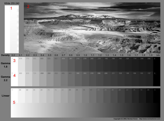
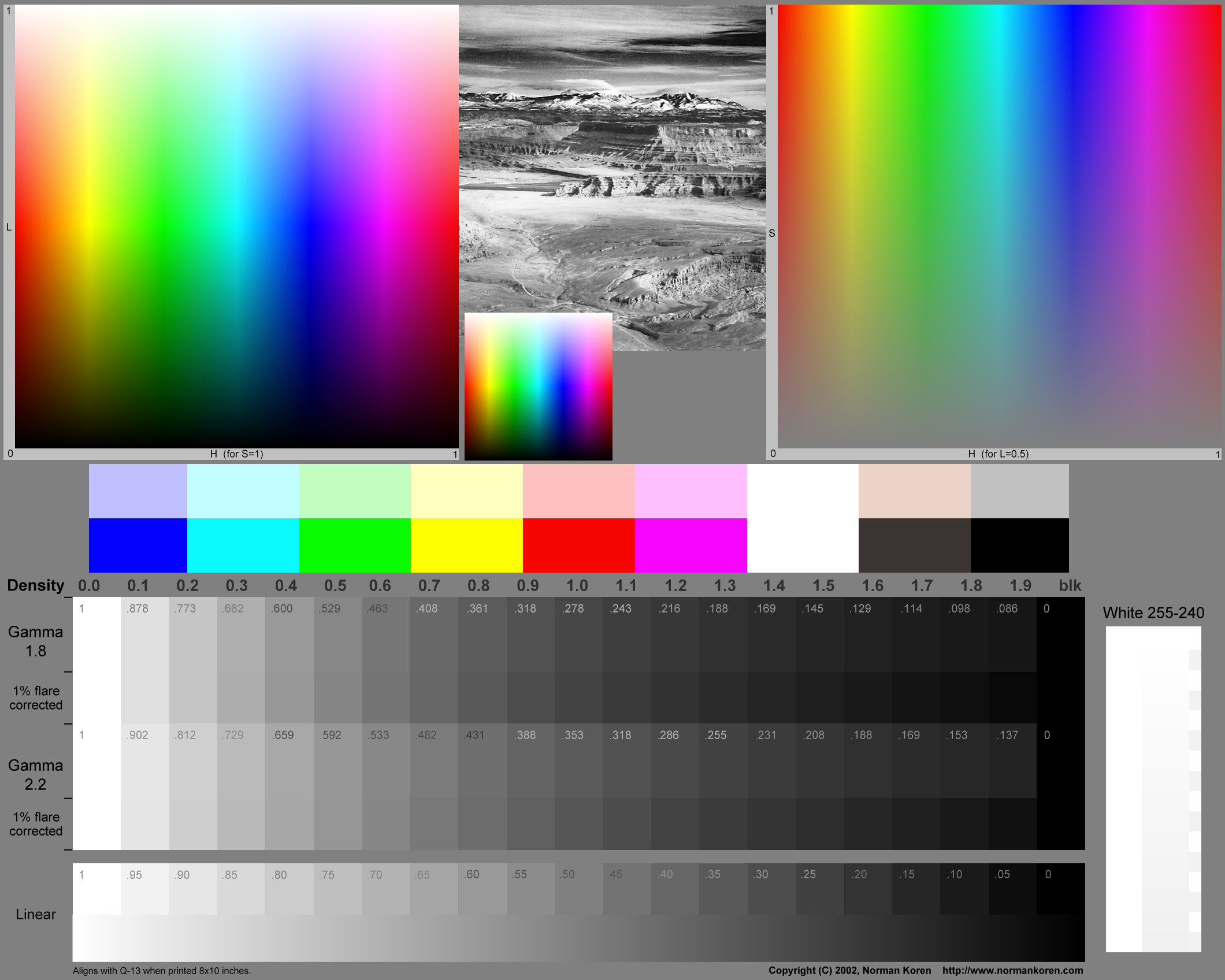
B&W
test/calibration chart
I have developed a test/calibration chart to aid in the development and
testing of B&W workflows. From top to bottom, the chart contains,
- White
255-240 (top left) A highlight discrimination
chart with pixel levels decreasing from 255 (pure white), top center,
to
240, bottom center. Pure white (255) on the left for reference.
Alternating
rectangles on the right (pixel levels 255, 242) to indicate positions.
This chart shows the level where density first becomes visible on
prints
and monitors. 255 should be pure white. If levels below 254 are
invisible
on the print, you may want to consider (a) getting a better printer or
printer profile (if you use color
management),
(b) not using more than one level where no image appears, or (c)
bringing
levels down in the Tint transformation.
- A full
toned B&W image (top
right) that should look excellent when the workflow is
properly set up and calibrated. The image of Dead Horse Point, near
Moab,
Utah, was originally taken in color, but I prefer it in B&W.
- Gamma
1.8 A step chart that closely
approximates
the Kodak Q-13 Gray Scale when printed with gamma = 1.8 (for older
Macintosh
systems; 2/2 seems to be the current standard). The numbers in each box
are the normalized pixel levels. In
two
parts: the upper part is uncorrected. The lower (smaller) part is
corrected
for 1% viewing flare, or equivalently, a maximum print density of 2.
Details
below.
- Gamma
2.2 A step chart that closely
approximates
the Kodak Q-13 Gray Scale when printed with gamma = 2.2 (for Windows
systems).
In two parts: the upper part is uncorrected. The lower (smaller) part
is
corrected for 1% viewing flare, or equivalently, a maximum print
density
of 2. Details below.
- Linear
2 parts: Upper: A step chart with normalized pixel levels
decreasing linearly from 1 to 0 in steps of 0.05 (unnormalized pixel
levels
decreasing from 255 to 0 with average step of 12.25, rounded). Valuable
for identifying the precise level where density or tint needs
correction. Lower:
A continuous pattern, varying linearly from pixel level 255 to 0. This
will reveal any irregularities in your printer.
The full-sized chart, suitable for printing, can be downloaded as a 360
kB high quality B&W JPEG by shift-clicking here.
You can also download it as a 400 kB high quality color JPEG (all
colors
the same) with an embedded sRGB profile (gamma = 2.2) by shift-clicking
here.
Be careful if you convert to a profile with different gamma (any of the
Apple profiles); this can alter the levels in the step charts.
 The 8 inch long Kodak Q-13 Color Separation Guide and Gray
Scale
(cat. 152 7654) is available from Adorama
for approximately $17. The Gray Scale, illustrated below, has densities
from 0.05 to 1.95 in twenty steps of 0.1 (1/3 f-stop), labelled 0 (A)
through 19. (Recall, density = -log10(reflected
light/incident
light.) Density = 0.05 is the reflectivity of white paper: about 90%.
The
step charts for gamma = 1.8 and 2.2 (above) have densities from 0 to
1.9
in steps of 0.1. When printed in a properly calibrated system they
should
closely match the Q-13 because typical paper adds about 0.05 to the
density.
The match should hold up well to about density = 1.7, where it can
diverge
for different paper surfaces and inks (the Q-13 has a luster surface).
The 8 inch long Kodak Q-13 Color Separation Guide and Gray
Scale
(cat. 152 7654) is available from Adorama
for approximately $17. The Gray Scale, illustrated below, has densities
from 0.05 to 1.95 in twenty steps of 0.1 (1/3 f-stop), labelled 0 (A)
through 19. (Recall, density = -log10(reflected
light/incident
light.) Density = 0.05 is the reflectivity of white paper: about 90%.
The
step charts for gamma = 1.8 and 2.2 (above) have densities from 0 to
1.9
in steps of 0.1. When printed in a properly calibrated system they
should
closely match the Q-13 because typical paper adds about 0.05 to the
density.
The match should hold up well to about density = 1.7, where it can
diverge
for different paper surfaces and inks (the Q-13 has a luster surface).
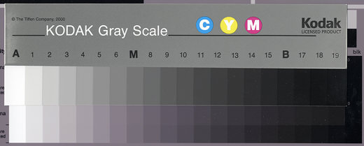
Kodak Q-13 Gray Scale superposed on printed step chart for gamma=2.2
(region 4).
When the B&W test chart is printed 9.08 inches (23.1 cm) long
(0.96
inch borders on 11 inch long paper), the steps align with the Q-13.
This
makes it easy to observe tonal errors and metamerism (change in print
tint
under different light sources), by comparing the print with the neutral
gray Q-13, which has little, if any, metamerism. The print appears more
magenta than the Q-13 under the cold light of the Epson 2450 scanner.
The
print and Q-13 are much closer under halogen light.
Viewing flare is stray
light
from the environment (room illumination, monitor illumination bouncing
off clothing, etc.) that tends brighten dark areas of monitor images,
reducing
overall contrast. Viewing flare is also present in prints, where it is
caused by reflected light from the front surface of photographic
emulsions.
It can be severe in matte photographic prints, but less so in matte
inkjet
prints, where there is no emulsion. The lower portions of the step
charts
for gamma = 1.8 and 2.2, to the right of "1%
flare corrected,"
are corrected for monitor viewing flare equal to 1% of the white level.
This is equivalent to a maximum print density of 2.0. 1% viewing flare
is typical, although it can vary widely. These regions are useful for
comparing
monitor images and prints. If you compare the Q-13 to a printout of the
chart (above for the Epson 2200), the Q-13 densities fall between the
uncorrected
and corrected patches for the appropriate gamma-- closer to the
corrected
patches on my 2200.
The
normalized pixel levels in the step charts for gamma = 1.8 and 2.2 are
derived from the equations, luminance = L = (pixel/255)gamma
+ black level, with black level assumed to be 0 (no viewing flare), and
density = d = -log10(L). This results in
pixel
= round(255*10-d/gamma), where round denotes round to
the nearest integer. Normalized pixel level = pixel/255 ~= 10-d/gamma.
As a result of gamma, contrast is much lower at low luminance levels
(high
densities). For example, for gamma = 2.2, luminances for normalized
pixel
levels 0.95 and 0.05 are 0.8933 = (1-0.1067) and 0.00137, respectively,
i.e., the contrast for the highest 5% of pixels is 78 times that of the
lowest 5%.
Black
level is a complex issue. In monitors it depends on the Black level
(Brightness)
setting and the ambient light, which results in viewing flare. In
prints
it depends on paper (it is lower for glossy surfaces), ink, ICC
profiles,
and viewing conditions. For this reason, you should not expect the
match
between the monitor and the uncorrected steps in the print at low
luminance
levels to be precise, but it should be close enough so the
print
matches your aesthetic intent.
The
steps corrected for viewing flare = 1% (0.01) are calculated assuming
black
level = 0.01. With L = luminance (no flare) and Lf =
luminance (with flare), Lf = 0.99L
+ 0.01 (normalized to 1) = 0.99(pixel/255)gamma + 0.01; L
= (Lf - 0.01)/0.99 is used in the calculations.
Density
(with flare) = df = -log10(Lf )
takes the same values as d. pixel/255 ~= (10-df -
0.01) / 0.99)1/gamma.
The linear chart (which decreases from 1.0 to 0 in steps of 0.05)
illustrates
tones and tints at specific normalized pixel levels. Errors can be
corrected
using technique presented below.
.
 Color
test chart Color
test chart
I've a added a color test chart, similar to the B&W test
chart above
(features 1 through 5
are identical), with three additional images for color. Squares 6
and 7 contain ranges of HSL (Hue,
Saturation,
Lightness) colors. See Light
&
color for more about HSL.
Hue varies uniformly from 0 to 1 (Red - Yellow - Green - Cyan - Blue -
Magenta - Red) along the horizontal axis of both squares. Square 6
represents all the fully saturated colors (S=1). Lightness increases
from
0 to 1 along the vertical axis. Square 6a
is a reduced version of 6 (256x256
pixels) that may reveal some edge effects (hopefully) not apparent on 6.
Square 7 represents all colors
achievable
with L = 0.5, which is the level where maximum saturation takes place.
Saturation increases from 0 to 1 along the vertical axis. 8
is a replica (mostly) of the Kodak Q-13 Color Control Patches. The two
pairs of boxes on the right don't correspond precisely to the original.
This is not a complete test chart, which should include skin
tones and
familiar subjects-- see charts elsewhere. But
a comparison of the printed chart with the monitor image will reveal
printer
and profile flaws quite ruthlessly-- you may find it
useful
for diagnostic purposes. I plan to add a page with test results from
this
pattern-- there is a lot to learn. You can download it as a 400 kB high
quality color JPEG with an embedded sRGB profile (gamma = 2.2) by
shift-clicking here.
If you prefer to work in a different color space, such as Adobe RGB
(1998)
I recommend changing the embedded profile without changing the data,
which
is pure numeric.
I am moving this chart to its
own page.
|
B&W
workflows
If you print directly from a B&W image you don't have much control
over the tonal cast of the print-- you get one cast with your normal
color
settings and another for black ink only. You can use custom printer
driver
settings, but they aren't easy to work with-- they don't provided the
needed
control and they aren't compatible with color management systems.
.
|
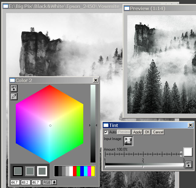
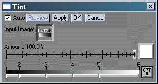
You
can control the color cast (tint) of B&W prints
with
Picture Window Pro's Tint
transformation.
|
|
|
.
B&W print tonality can be controlled precisely with Picture
Window Pro's Tint transformation, which converts
B&W
images into tinted color images. Tint can replicate sepia toning by
substituting
browns (dark unsaturated reds to oranges) for grays. Here we use it in
a more subtle way, taking advantage of its ability to save and load
settings.
You can learn more about
Tint in Digital Light and Color's white
paper, Colorizing Black and
White Photos.
I may try out at least one other workflow, based on the Gray
Balancer provided with the Epson 2100 outside North America. Several
workflows are discussed in Luminous-Landscape.com's
excellent pages on the Epson 2200. Carl
Schofield's is useful for Photoshop users.
All of these workflows suffer from one limitation: Epson inkjet
prints
have a degree of viewing illuminant
sensitivity--
their color cast changes under different lighting. A 2200 print that
appears
neutral under daylight appears slightly magenta to reddish under
tungsten
(or halogen) light. This effect is much more noticeable with B&W
than
with color prints. It is frequently called
metamerism, after
the property of human vision that causes images with different spectral
absorptions to appear the same under one light source but different
under
another. The 2200 has less metamerism than the 1270/1280/1290, but it
isn't
perfect. The 2000P was apparently dreadful-- it was not recommeded for
B&W. Ultimately, you have to deal with viewing illuminant through
compromise:
choose a tint that looks decent under the expected range of illuminants.
A solution for metamerism? Outbackphoto.com
claims to have found a solution: the ImagePrint
5.0 Raster Image Processor (RIP). This expensive
software ($495 for the 1270/1280/1290/2200, $1,495 for the 7600, and
$2,495
(!) for the 9600) completely circumvents Epson's printer drivers: it
has
its own algorithms for laying down ink. For B&W, it apparently
avoids
inks that cause metamerism. Since you can get full tonal control
without
Cyan and Magenta (LC and LM suffice), and since strongly colored inks
are
the likely cause of metamerism, I suspect the C and M inks are simply
omitted.
There is no way you can do this using the Epson drivers. I'm not likely
to try it soon because of the cost, but I'm tempted. ImagePrint could
close
the quality gap (prety narrow by now) between inkjet and traditional
darkroom
prints. Luminous-landscape.com
has a review. I'll be watching...
EPSON
1270 The Tint transformation allows
you to correct an undesirable color cast or add a desired cast, such as
sepia, to B&W images. Settings can be saved and loaded. The
procedure
below enables you to establish and use a settings file-- to get the
tones
you
want. This is important because taste is an individual matter and
printers
vary from unit to unit. You can start with a neutral tint (no
adjustment;
plain gray), or optionally, start with a file that works for me with my
standard settings. The latter procedure will be denoted
(Optional).
- (Optional)
Download the initial Tint settings file by shift-clicking on Matte_Hvy_BW_tint_1.cln.
Save it in a directory you can easily access. This file works for
B&W
prints on my 1270 printer using my normal settings for color printing
on
Matte Heavyweight paper (Photo-1440dpi, HQ Halftoning,
Gamma
2.2, Photo-realistic, Brightness +3, Contrast +11, Saturation +5, Cyan
+4, Magenta =2, Yellow +4). If any of these change-- and they
will
from time-to-time-- the Tint settings will have to change. DISCLAIMER:
To
get pleasing results on your system-- the precise tint you
want--
you may want to modify these settings using the trial-and-error process
that follows. Please don't e-mail me if the print doesn't look
good
the first time.
- Open Picture Window Pro.
- Select a B&W image to print. I
suggest
that you
make test prints half-letter size (5½x8½
inches) with at least ½ inch margins-- they will print quickly
and
you won't waste much ink.
- Click on Transformation, Gray, Tint...
to display the Tint dialog box (bottom right in the
illustration
below).
- (Optional,
first and second passes only) In the Tint dialog box, Click OPT, Load...,
then load the file you downloaded: Matte_Hvy_BW_tint_1.cln.
- Omit the following steps the first time or if you've used
a text editor to modify the Tint file.
- If you saved a Tint settings file on the previous pass, click OPT, Load...,
then load it.
- Double-click on the bar below the number 2 in the Tint dialog
box to
open
the Color picker dialog box for color 2 (bottom left in
the
illustration below). Color 2 controls the midtone tint. You probably
won't
need to change colors 1 (black) or 3 (white).
- Adjust the tone by moving the circle, visible near the middle
of the
color
hexagon. Aim for the desired color cast (or the compliment of the
offending
cast in the test print). You can also set the numbers in the boxes,
shown
here for RGB color space. (HSV
and
HSL are available.) The color picker allows additional adjustments
not applicable to the B&W workflow.
- If you wish to add additional color control points, you may do
so by
shift-clicking
on the appropriate location in the bar below the numbers. Bring up a
Color
picker for each new point by double clicking at the same location.
Several
Color pickers can be open at once. You can delete control points by
control-clicking
on them. If you move them (which I don't recommend for the B&W
workflow)
you may need to adjust the tone setting on the right of the Color
picker.
- Save the Tint settings (to a .cln file) by clicking OPT, Save
as... in the Tint dialog box. Give the file a easily
recognizable
name and make sure it is in a convenient directory.
- Click OK in the Tint dialog
box to
complete the transformation. The color output file is 3 times the size
of the B&W input file. You won't need to save it.
- With the color output file selected, Click File,
Print... Select the Epson 1270, then either use you standard Printing
Preferences, or (Optional,
if you loaded my file, which works for Matte Heavyweight paper: set Printing
Preferences to Color Controls
with Photo-1440dpi, HQ Halftoning, Gamma 2.2, Photo-realistic,
Brightness
+3, Contrast +11, Saturation +5, Cyan +4, Magenta =2, Yellow +4).
Click OK (twice, if needed), then Print.
Make sure the paper size and margins are correct, then click OK.
Printing should start.
- Give the print sufficient time to dry. View it under a Halogen
lamp and
in daylight or under a daylight lamp such as the SoLux
(4700K). View it under both light sources, if possible, to account for
metamerism. Carefully observe the color cast of
the
print.
- If you are pleased with the result, the setup is complete. Use
the
simple
procedure below for each B&W print. If you are not pleased, delete
the color output file, modify the Tint
control
file (if you choose to use a text editor), then go back to step 4.
You should achieve perfection in two or three iterations.
Once you have a satisfactory Tint settings file, here is how make a
B&W
print.
- Select the B&W image you wish to print, then click Transformation,
Gray, Tint... to display the Tint dialog box.
- In the Tint dialog box, Click OPT,
Load...,
then select the Tint settings file you have saved.
- Click OK. Print the color
output
file
(3 times the size of the B&W input file) with the same settings you
used in the setup. You don't need to save it-- Whenever you need a
print,
just open the B&W file and repeat this procedure. It's fast and
easy.
The greenish cast in the preview is not what you see in a print;
it's the complement of the tint in a print made from a
neutral
gray image.
.
EPSON
2200 The Tint transformation allows
you to correct an undesirable color cast or add a desired cast, such as
sepia, to B&W images. Settings can be saved, edited, and loaded.
The
procedure below enables you to establish and use a settings file-- to
get
the tones you want. This is important because taste is
an
individual matter and printers vary from unit to unit. The Epson 2200
also
suffers from a degree of metamerism. Prints that appear neutral in
daylight
appear reddish to magenta under tungsten light.
My workflow employs Color
Management,
using the ICC profiles hidden on the Epson 2200 Installation CD in
TITLES\PIM\color.
These ICC profiles can also be downloaded from
Epson
Australia and Ian
Lyons' site. In the file names, PK denotes Photo black (for glossy
papers) and MK denotes Matte black.
Why use color management for B&W prints? Because the
Epson-supplied
profiles give consistent results over the full range of Epson papers
and
inks. Color prints match my monitor image nicely, and the ICC profiles
are not difficult to use-- complete instructions are given below. If
you
want to learn more about color management, read my series.
Here is the procedure for setting up your workflow-- for obtaining a
Tint settings file that pleases you.
- Download the initial Tint settings file by shift-clicking on BW_1_EpsProfl.cln.
Save it in a directory you can easily access. DISCLAIMER:
To
get pleasing results on your system-- the precise tint you
want--
you may want to modify these settings using the trial-and-error process
that follows. Please don't e-mail me if the print doesn't look
good
the first time.
- Open Picture Window Pro. Make sure Color
Management:
is Enabled.
- Select a B&W image to print. I
suggest
that you
make test prints half-letter size (5½x8½
inches) with at least ½ inch margins-- they will print quickly
and
you won't waste much ink.
- Click on Transformation, Gray, Tint...
to display the Tint dialog box (bottom right in the
illustration
above).
- In the Tint dialog box, Click OPT,Load...
On the first and second passes, load the file you downloaded: BW_1_EpsProfl.cln.
On succeeding passes, load your own modified Tint file, if you gave it
a different name.
- Omit the following steps the first time or if you've used
a text editor to modify the Tint file.
- Double-click on the bar below the number 2 in the Tint dialog
box to
open
the Color picker dialog box for color 2 (bottom left in
the
illustration above). Color 2 controls the midtone tint. You probably
won't
need to change colors 1 (black) or 3 (white).
- Adjust the tone by moving the circle, visible near the middle
of the
color
hexagon. Aim for the desired color cast (or the compliment of the
offending
cast in the test print). You can also set the numbers in the boxes,
shown
here for RGB color space. (HSV
and
HSL are available.) The color picker allows additional adjustments
not applicable to the B&W workflow.
- If you wish to add additional color control points, you may do
so by
shift-clicking
on the appropriate location in the bar below the numbers. Bring up a
Color
picker for each new point by double clicking at the same location.
Several
Color pickers can be open at once. You can delete control points by
control-clicking
on them. If you move them (which I don't recommend for the B&W
workflow)
you may need to adjust the tone setting on the right of the Color
picker.
- Save the Tint settings (to a .cln file) by clicking OPT, Save
as... in the Tint dialog box. Give the file a easily
recognizable
name and make sure it is in a convenient directory.
- Click OK in the Tint dialog
box to
complete the transformation. The color output file is 3 times the size
of the B&W input file. You won't need to save it.
- With the color output file selected, Click File,
Print... Select the Epson 2200, then set Printing
Preferences for the correct media type (Premium
Luster, etc.), Photo - 1440 dpi,
and No Color Adjustment. Click OK
(twice, if needed), then Print.
Select
the appropriate Custom Profile in
the Print
dialog box (Color management: must
be Enabled for Custom
Profile to appear). Make sure the paper size and margins are
correct,
then click OK. Printing should
start.
- Give the print sufficient time to dry. View it under a Halogen
lamp and
in daylight or under a daylight lamp such as the SoLux
(4700K). View it under both light sources, if possible, to account for
metamerism. Carefully observe the color cast of
the
print.
- If you are pleased with the result, the setup is complete. Use
the
simple
procedure below for each B&W print. If you are not pleased, delete
the color output file, modify the Tint
control
file (if you choose to use a text editor), then go back to step 4.
You should achieve perfection in two or three iterations.
Once you have a satisfactory Tint settings file, here is how make a
B&W print.
- Select the B&W image you wish to print, then
click Transformation,
Gray, Tint... to display the Tint dialog box.
- In the Tint dialog box, Click OPT, Load...,
then select the Tint settings file you have saved.
- Click OK. Print
the color output
file
(3 times the size of the B&W input file) with Color
Management: Enabled, using the same settings you used in the
setup.
You don't need to save it-- Whenever you need a print, just open the
B&W
file and repeat this procedure. It's fast and easy.
|
| Taste Even
though my prints closely match my monitor image, I find a subtle but
important
difference between them. Images that look good-- that feel
right--
on my monitor may look a little soft as prints. This situation can be
corrected
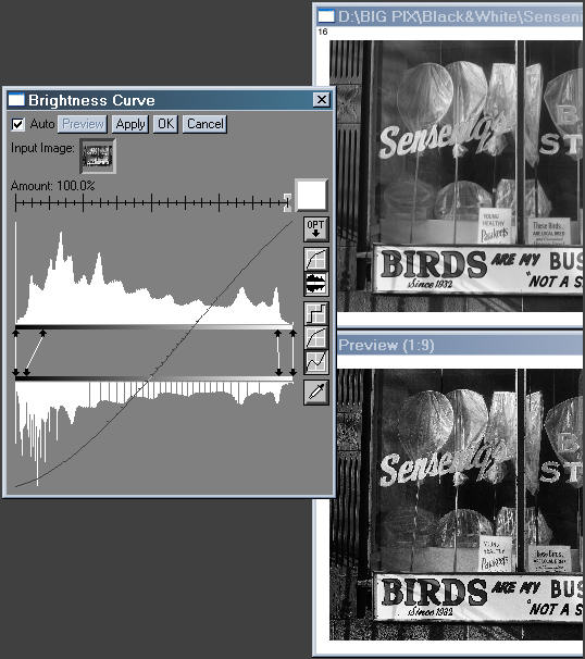
by editing for higher contrast or by using the Brightness
Curve... transformation (illustrated on the right) to boost
contrast--
to
add a little "snap" to the image. Pay close attention to the feel
of your monitor image and prints. How do they compare? (Your situation
could be reversed from mine.) You'll need to adapt-- to adjust images
on
your monitor for the contrast that looks good in prints, even if it
seems
a little snappy (or soft) on your monitor. |
|
|
 |
.
| Customizing
the Tint control file |
Picture Window Pro's Tint
transformation
converts B&W (grayscale) images to tinted color images. Tint
control
(.cln) files have an easy-to-interpret ASCII text format that contains
more information than The Tint dialog box, which omits the gray level
(normalized
pixel level) you are transforming..from.
Here is the contents of BW_1_EpsProfl.cln
and the corresponding dialog box. Note that color 0
corresponds
to control point 1 in the box, etc. A little confusing.
Colorline 1.0
ncolors 6
color 0 0.0000 0.0000 0.0000 0.0000
transition 0 line rgb
color 1 0.100 0.100 0.090 0.090
transition 1 line rgb
color 2 0.300 0.295 0.300 0.300
transition 2 line rgb
color 3 0.500 0.485 0.500 0.500
transition 3 line rgb
color 4 0.700 0.690 0.700 0.700
transition 4 line rgb
color 5 1.0000 .996 .996 .996
end |
|
|
ncolors is the number of colors (including
black and white).
The colors and transitions between them follow. You can add colors and
transitions using a simple editor such as Notepad or Wordpad; just be
sure
to get sequence (0 through ncolors-1) correct.
On the color lines, the entries are,
color sequence [gray-from] [R-to] [G-to]
[B-to]
For example, for control point 3, color 2 0.300 0.295 0.300 0.300 maps
gray level 0.300 to R = 0.295, G = 0.300, B = 0.300. This corrects a
slight
visible red cast at level 0.3. These levels correspond to the numbers
printed
on the B&W test/calibration chart.
Since
green corresponds closely to luminance, I keep [G-to] the same as
[gray-from]
unless I want to change the luminance, which I do, ever so slightly, in
color
1. Colors can be represented in HSV or HSL spaces, but I
prefer
the default RGB.
This file, BW_1_EpsProfl.cln,
corrects
some of the tonal irregularities in the Epson profiles. Color 1
slightly darkens the darkest ares (which are affected by viewing flare)
and gives deep grays slight reddish tint (a preference of mine). Color
2 through color 4 correct for slight reddish casts in
the
print, which can be objectionable in tungsten light. Color 5
brings
down the highest (white) levels so no detail is lost. The value of
0.996
(254/255) was chosen because no density was observed in level 254 when
the B&W test/calibration chart was
printed
without Tint. Even with this transformation, some small tonal
irregularities
remain with the Epson profiles. George
Lepp developed a set of profiles that are more uniform. I had
planned
to develop a set of tint transformations for them, but they are no
longer
available due to product license restrictions. David
Conn is also working on developing Tint transformations.
|
|
.
Other
B&W processes
Piezography from Cone
Editions Press (Inkjetmall.com). A printing process that uses
special pigment inks in older Epson printers such as the 1200, 1520 and
3000, which may (?) be available at reasonable prices in places like
eBay.
Separate systems for B&W and color. Requires special papers,
printer
drivers and profiles for Photoshop. Claimed to be highly archival,
extremely
sharp and possess a wide color gamut. Intriguing,
but may require a significant learning curve (color management is a
must).
Somewhat expensive. Reviewed favorably by Ian
Lyons, Michael
Reichmann, Vladimir
Kabelik, and George
DeWolfe. Ron
Harris wasn't impressed at first, but he's grown more positive. I'd
thought about trying try it on a long neglected 1200 if I could unclog
the print head, but the 2200 prints B&W admirably.
Lyson
Small Gamut inks for most of the better Epson inkjet printers
made
in the last 5 years (3000, 740, 800, 850, 860, 1160, 1200, 1270, 1280,
1520, 7000, 9000). (Lyson
site) This ink set allows subtle control of B&W print tonality.
Jorge
Ituarte was initially enthused (using InkJetArt
Micro Ceramic Luster paper, which costs $55.00 for a box of
50
13x19 sheets; $4.00 per print with ink), but he eventually switched to
Lyson
Quad Black inks. A few months later fading
was reported on photo.net. Perhaps no dye-based inkset is immune
from
fading.
Quadtone inks can be used to make archival B&W prints
with
old Epson printers, but getting good results can be tricky. MIS
Associates' quadtone
workflow page is a good source of guidance. Lyson
also makes three Quad
Black ink sets: cool, neutral, and warm.
ImagePrint
5.0 Raster Image Processor (RIP), recommended by Outbackphoto.com.
This expensive
software ($495 for the 1270/1280/1290/2200, $1,495 for the 7600, and
$2,495
for the 9600 (ouch)) apparently eliminates metamerism from B&W
inkjet
prints. It can be used with standard Epson inks as well as quadtones. A
friend (John Wislar) isn't completely satisfied with its tonal
rendition,
but it has many advocates, especially
for B&W. Excellent profiles are available
for
a wide variety of papers.
Epson's
StylusRIP Professional for the Epson Stylus Photo 2200
for $200 (you'll have to navigate their site or enter "RIP" into the
search
box) sounds promising for B&W. Allegedly supports ICC profiles. The
PDF user manual is available. This
photo.net post has some interesting material, along with the usual
hot air. One of my readers had extremely poor results with it. It
apparently
uses an archaic form of color management; he found that it doesn't
support
standard ICC profiles. Peter
Nelson's page on Black
and White Printing on the Epson 2200 is particularly interesting.
I've
never used a RIP, so I can't comment. RUMOR:
Epson may
be developing a capability similar to an RIP for controlling ink in
B&W
prints, to be included in a future release of the 2200 driver software.
This would be very
good news to consumers if they do a decent job of it (far from certain).
B&W
Links
- Yahoo!
Groups: Digital Black and White, The Print A lot of
excellent,
advanced material, but as with all such groups, you have to wade
through
a lot of words to find the gems. "This
forum was founded for the discussion and exchange of information about
all the technologies and techniques that can be used to produce a
quality
B&W print from a digital source. The intent here is to bring
together
those resources in one location to further the craft and technology of
B&W output. This forum is not affiliated with any commercial
venture
and is open to all."
- Ron
Harris
has
used the 1270, 1280, 2000P, and 2200 printers for B&W printing. He
didn't like the 2000P. He has some information on 2200 workflows on his
page, which he keeps up to date.
- David
Conn
has developed a B&W workflow using the Picture Window Pro workflow,
but he's carried it further than I have. (I'll be working on catching
up.)
He uses more levels to achieve finer control.
- Peter
Nelson has a page on Black
and White Printing on the Epson 2200 with information on RIPs
(raster
image processors).
- Stability
of Black-and-White Photographic Images, with Special Reference to
Microfilm
There is a widespread belief that properly processed silver-based
B&W
prints are far more archival than pigment-based inkjet prints. It's not
quite that simple. Oxidation of silver can be as harmful as residual
hypo.
A tiny amount of residual hypo may, in fact, be beneficial. Sulfiding
seems to be the key to protection; Kodak Brown Toner is apparently more
effective than Selenium toner, which was strongly advocated by Ansel
Adams
in The Print. (And I happen to like the look.)
Superior Archival
Materials
sells mat and foam boards and storage cases that provide more
protection
than standard acid-free materials: their products employ a special
technology
that actively absorbs pollutants. This can make a big difference in the
longevity of silver-based B&W prints and chromogenic (traditional)
color prints. Not yet tested with pigment-based inkjet prints.
.
| Images
and text copyright (C) 2000-2013 by Norman Koren. Norman Koren lives
in Boulder, Colorado, where he worked in developing magnetic recording
technology for high capacity data storage systems until 2001. Since 2003 most of his time has been devoted to the development of Imatest. He has been involved with photography since 1964. |
 |