Color management:
Obtaining ICC profiles and building them with MonacoEZcolor
by Norman Koren
|
|
|
The series begins with an Introduction to color management and color science. Implementation part 1 describes how to set up color management and interpret the contents of ICC profiles (files that describe the color response of a device or a color space). It features Picture Window Pro, but includes information on Photoshop. Implementation part 2 discusses monitor profiling and workflow details. The series continues with Obtaining ICC profiles and building them with MonacoEZcolor (this page) and Evaluating printers and ICC profiles.Thanks to Dennis Wilkins and Jonathan Sachs for excellent suggestions and extensive proofreading.
February, 2004. Epson has released a new set of ICC profiles for the 2200 printer. The profiles are for 1440 and 2880 dpi for Premium Luster, Semigloss, Glossy, Enhanced Matte, Watercolor - Radiant White, Velvet Fine Art, and PremierArt™ Water-Resistant Canvas. I haven't had a chance to evaluate them. Finding them can be a little tricky because you can't link directly to Epson pages, and as of February 2004 they're not yet on Epson USA's Drivers & Downloads page for the 2200. To locate them you must click on Announcements (in the left column), then click on New ICC Profiles for Epson Stylus Photo 2200. They obvouisly won't be there forever; I'll update this page when they move. I have a problem with the workflow in their How to use ICC profiles document. In Step 7 for Windows, it recommends selecting Assign working RGB: Adobe RGB (1998) for documents that have no embedded ICC profile. This is generally a bad practice because the Windows default color space for images with no embedded profile is sRGB. But there are exceptions. If you convert a RAW file to Adobe RGB (1998) with Canon's (mediocre) File Viewer Utility, it won't embed a profile. Bad practice, but Epson's recommendation is appropriate in this case. Then in Step 8 it recommends assigning a different profile if the color balance appears incorrect. Very slipshod! It's best to select the correct profile when you open the file, then use other adjustments. |
Manufacturer's profiles and free downloads. Manufacturers often supply ICC profiles with driver software CDs or on their websites. Opinions vary about their merits. They can be inaccurate or out of date, but I've had good luck with profiles for the Epson 2200. Some excellent profiles are available from independent photographers.
Epson's ICC profiles for the 2100/2200 are fairly accurate, particularly for color images. They need a bit of adjusting for B&W. They can be found on the Epson 2200 printer installation CD in TITLES\PIM\color. Epson did a great job of hiding them; they are not mentioned in "Printer Basics" manual. A friend found them by accident. Luminous-Landscape.com confirms their accuracy. The Archival Matte MK and Watercolor-RW MK profiles worked so well (No Color Adjustment, 1440 dpi) that I haven't bothered to make custom profiles with MonacoEZcolor.
Epson profiles (the 2100/2200,1280/1290, 890, 895, 810/820 and 1270) are available on Ian Lyons' site, apparently supplied by Epson. There were six for the 2200: Archival Matte MK and PK, Glossy-PW PK, Standard MK and PK, and Watercolor-RW MK. (MK is Matte Black ink; PK is Photo Black ink; I have no idea what "Standard" means.) Epson Australia also has profiles and a useful RGB Printing Guide. (Why not US, UK?) For the 2200 they have Archival Matte MK and PK, Watercolor-RW MK and PK, and Premium Seimgloss and Glossy-OW PK (a different set from Lyons).
Tim Grey (associated with George Lepp) had some excellent profiles for the Epson 2200, but removed them when he discovered restrictions in the MonacoPROOF license-- about as severe as Microsoft claiming ownership of anything you write using Word. Microsoft wouldn't dare go that far, but Monaco, on the other hand, is far enough under the regulatory radar to get away with it.
John Fellers, a friend who teaches photography part-time at the Art Institute of Colorado, has created two profiles for the Epson 2200. Here are his comments.
I'm enclosing two print profiles created on AIC's Gretag/Macbech EyeOne system. I really like the product except for two things: 1. It's pretty pricey, around $3,000. 2. It doesn't have much latitude for error. On certain paper types, like Epson Professional Glossy, it seems to be impossible to get a profile at all. Despite several attempts I (and others) always get a 'Delta E' error while trying to profile the Epson glossy paper. I also ran across this error while trying to read a test chart from a student's Hewlet Packard Inkjet. Minor surface imperfections in the test chart can also throw the system off.I haven't tested these profiles yet. I'll add comments when I get around to it. Shift-click to download John's Epson 2200 profiles for Premium Luster (RadWhiteCaterCol_10-23-02_3.icc) and Radiant White Watercolor (PremLuster10-23-01_4.icc) papers. The desc tag contents (which appears in Picture Window Pro's profile list) is in parentheses. They're both about 558 kilobytes.Oh well, I don't like glossy anyway. My Luster profile was a definite improvement over Epson's, but my Radiant White Watercolor Profile gave only a slight improvement.
Bill Atkinson's excellent ICC profiles for the Epson 7600 and 9600 printers are now available from Epson North America. Here is Epson's announcement. It these links don't work, go to the Epson North America site and follow links to Support, Wide body printers, 7600 or 9600 Ultrachrome. Read more about the profiles on the West Coast Imaging site.
Red River, a manufacturer of fine art inkjet papers, supplies profiles for the Epson 2200 Profiles for other printers are on the way.
ColorHQ.com | ColorManaged.com
Create your own. The chief advantage is that the profile matches your own equipment: digital cameras, scanners, monitors and printers suffer from manufacturing variations; all change as they age. Then there are inks and papers... A profile you purchase may not match your individual device. If you experiment with a variety of art papers and inks, you'll need a profile for each combination. You'll save money by making your own; they may be hard to find for unusual combinations of materials. The disadvantage of making your own profile is that, unless you have the budget for a colorimeter or spectrophotometer, you'll make them on a flatbed scanner, whose spectral response is not a good match to the human eye. Also, flatbed light sources can emit significant ultraviolet light, which can cause some inks to flouresce (emit visible light in response to UV). How serious a disadvantage is controversial and depends on the scanner model and inks (no, I don't have the answer). My view is that you can make excellent profiles with a good quality scanner (I use the Epson 2450) if you have a profile editor to correct for the inevitable small errors. Your eye is the ultimate judge of profile quality.
Profilecity.com Their knowledge base has some excellent, detailed articles.A warning about profiles, which I will repeat. They must be used with exactly the same device settings used to create them. Otherwise results are unpredictable. For Epson printers, that usually means No Color Adjustments. Some exceptions are print speed (fast for bidirectional) and scan resolution, neither of which affect color. Any profile you download or purchase should include complete information on device settings.
Inkjetmall.com Jon Cone also sells art papers and Piezography archival inks for both B&W and color.
Chromix.com
Cathy's Profiles Norwalk, California. Reasonable-- $40 per profile. Recommended by Bernard Leverd.
Paul Holman United Kigdom. Has an interesting page explaining profile quality using my test charts.
|
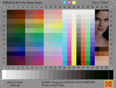
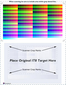
| IT8 targets, which conform to ANSI standard
IT8.7 (ISO 12641), are widely used in color management. When an IT8 traget
is calibrated-- accompanied by a reference file that describes its
precise colors-- it becomes a powerful tool for building profiles. The
Kodak
Q60 is perhaps the best known of the IT8 targets; Kodak's detailed
description
is worth reading. IT8 targets come in 35mm and 4x5
transparencies and in 5x7 reflective
prints.
IT8 targets contain a 12 row (A-L) by 22 column pattern of color patches along with a 22 step neutral scale on the bottom. Columns 1-12 contain a uniform distribution of hue angles at three lightness levels and four saturation levels. Column 13-19 contain C, M, Y, K, R, G, and B in uniform lightness steps. Columns 20-22 are not defined by the standard. Manufacturers use them for their own purposes, frequently for flesh tones. Kodak's is the only one with a portrait. IphotoMinusICC has a FAQ that compares several. |
 |
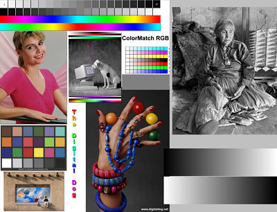
 With
MonacoEZcolor
2 you can build monitor, input (scanner or digital camera) and printer
profiles, and you can edit printer profiles. Printer profiles are created
using a flatbed scanner. Monaco's calibrated IT8 target is included. An
optional
MonacoSENSOR
colorimeter that attaches to the CRT screen (right) facilitates monitor
profiling. I selected MonacoEZcolor 2 because it includes a profile editor,
which I regard as critical; no scanner-based profiler can produce perfect
results without some editing. Monaco's
website has plenty of information, including the complete
user guide in PDF format. EZcolor guides you through each operation,
step-by-step, and you can go back if need be. I'll summarize the operations
briefly.
With
MonacoEZcolor
2 you can build monitor, input (scanner or digital camera) and printer
profiles, and you can edit printer profiles. Printer profiles are created
using a flatbed scanner. Monaco's calibrated IT8 target is included. An
optional
MonacoSENSOR
colorimeter that attaches to the CRT screen (right) facilitates monitor
profiling. I selected MonacoEZcolor 2 because it includes a profile editor,
which I regard as critical; no scanner-based profiler can produce perfect
results without some editing. Monaco's
website has plenty of information, including the complete
user guide in PDF format. EZcolor guides you through each operation,
step-by-step, and you can go back if need be. I'll summarize the operations
briefly.
|
 |
|
 |
Now here's where it gets tricky. Both of the papers I use with the Epson 1270, Matte Heavyweight and ColorLife, suffer from a degree of viewing illumanant sensitivity, also known as metamerism. Neutral tones change their appearance under different light sources. If they look distinctly reddish under halogen lights, they are nearly neutral in daylight. You must therefore carefully choose the light source for viewing prints. A compromise between halogen and daylight is reasonable. The 4700oK Solux. Desk Task Lamp is very promising.By all accounts, metamerism is much more severe in the Epson 2000P pigment-based printer. Epson's new line of 7-color UltraChrome pigment-based printers, the 2100/2200, 7600, and 9600, have relatively little metamerism-- less than the 1270/1280/1290. This is good news because of their excellent print longevity, estimated at 75-100 years.
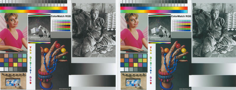
The results of editing are illustrated in the side-by-side images above, both scanned from prints made on the Epson 1270 on Matte Heavyweight paper. The left image was printed using the original profile calculated by MonacoEZcolor. The right image was printed on the edited profile, based on the appearance of the print under halogen light.
The surprise here is that the scanned image on the left, made with the unedited profile, looks better. It matches the original file extremely well-- particularly impressive since it was made on a matte paper (albeit the best matte surface I've ever seen), which can never have the brilliance of glossy. The scanned image on the right, printed with the edited profile, looks a little too cyan. The original looks better, particularly under halogen light-- better than the image on the left.
Why the discrepancy? Two reasons. 1. The scanner light source has a high color temperature-- closer to daylight than to halogen. Metamerism makes the images appear bluer. 2. The Epson scanner profile is biased towards green. This has little effect on the calculation of printer profiles since they are based on a comparison of the IT8 and printer targets, but it's a problem nonetheless. MonacoEZcolor has no editor for scanner profiles.
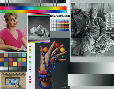
The two images below were scanned with two different scanner profiles from the same print, made on the 1270 on ColorLife paper with an edited printer profile. The MonacoEZcolor-generated profile is on the left; the Epson default profile is on the right. The MonacoEZcolor profile results in a greenish cast. The Epson standard profile results in a slightly bluish cast. I find it to be slightly more accurate. The visual match between the original image and the print is outstanding for this printer profile.
Scanned prints (Epson 1270 printer, ColorLife paper, modified profile)
Left: Monaco EZcolor-generated scanner profile; Right: Epson
standard scanner profile.
 |
 |
A small disappointment: I tried to build profiles with Color Management set to Color Controlsinstead of No Color Adjustment. Gamma(D) was set to 2.2; Mode to Automatic, and the remaining controls (Brightness, Contrast, etc.) to +0. With this approach I hoped to use the Color Controls settings to make fine adjustments on the print; it would have been simpler than using the profile editor. But the prints came out strange for both 1270 paper types. Deep gray tones (zones 2-3) printed as deep, rich blues-- beyond the gamut of most monitors. Lovely, but not appropriate for neutral grays. I had to give it up.
I may have found the cause of the problem. Epson uses special profiles when Color Management is set to Color Controls or (apparently) any setting other than No Color adjustment. These profiles seem to conflict with other ICC printer profiles. Typical names are EE089__1.ICM and EE089__3.ICM (for the1270), and EE177__1.ICM (2100/2200). In the Print dialog box, they appear in the Custom Profile box as "Epson Stylus Photo 1270" and "Stylus Photo 2100/2200." These profiles should never be used here-- they are a source of considerable confusion.
Another disappointment: The profile editor only works with profiles created with MonacoEZcolor.
Do you need the MonacoSensor colorimeter? They are nice to have but not absolutely necessary for making fine prints. The gamma chart provides extremely accurate gamma and black level indications for calibrating your monitor. But it doesn't help with color temperature, which may not be extremely critical since the eye adapts rapidly when moving between the monitor screen and illuminated prints. On my system the Monaco profile, set for 6500K, makes the screen considerably warmer (lower color temperature) than when I set the monitor to 6500K. Thanks, perhaps, to the gamma chart, the sensor makes less of a difference to print quality than Monaco would like you to believe. But it doesn't hurt. Get one if you can comfortably afford it or if you are working professionally.
Film scanner profiles: Your approach to building a scanner profile depends on which of two possible scanning intents you choose.
The bottom line: MonacoEZcolor 2 is an excellent product. The flatbed scanner profile isn't perfect-- scans come out a little greenish, not as good as the Epson standard profile. But the printer profiles are outstanding, especially after a bit of editing. The match between the monitor image and the print is about as good as I can imagine; distinctly better than I can achieve using Color Controls.
|
|
|
|
|
|
|
|

| Images and text copyright © 2000-2013 by Norman Koren. Norman Koren lives in Boulder, Colorado, where he worked in developing magnetic recording technology for high capacity data storage systems until 2001. Since 2003 most of his time has been devoted to the development of Imatest. He has been involved with photography since 1964. |  |