Color management:
Evaluating color in printers and ICC profiles
by Norman Koren
|
|
|
| Note: This page was never completed. For evaluating ICC profiles, I recommend the Gamutvision program. |
The test chart in this article was designed to address these issues.
It contains several patterns for evaluating color quality, gamut and
gamma
(easy to confuse when you're starting out). Patterns 4-8 (numbered
differently)
were present in the
B&W
test chart, for calibrating gamma and evaluating B&W print
quality.
| Please
note:
This test chart is not
for calibrating your monitor or printer, i.e., it is not
for adjusting tonal balance (though it's rather good with brightness
and
contrast). For that purpose, use the test
images in Monitor
calibration
and gamma, which contain typical scenes and skin tones.
It will reveal imprefections in most printers. Many printers perform quite well despite these weaknesses. Please don't expect your printer to be perfect, and don't e-mail me for help in fixing it, especailly with models I'm unfamiliar with (I'm using an Epson 2200). |
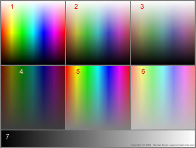
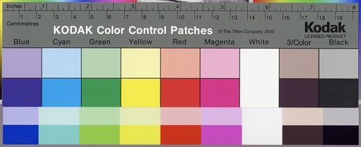
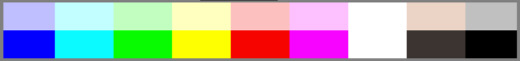
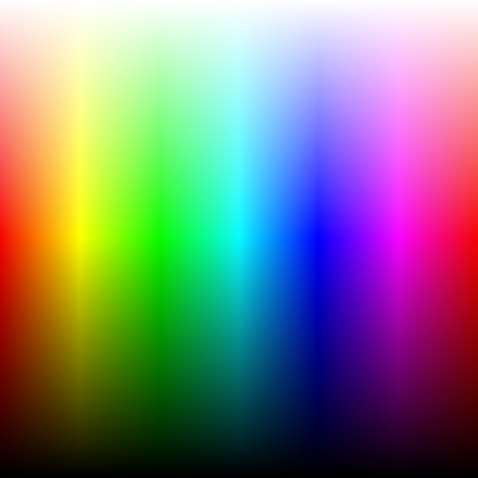
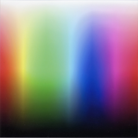
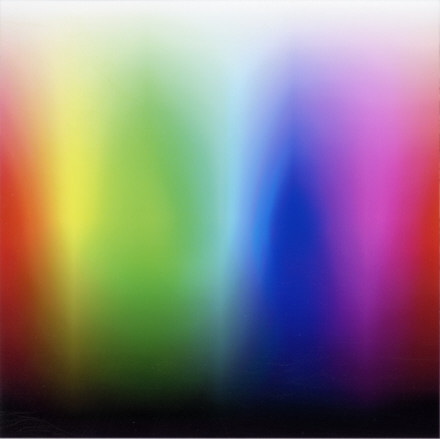
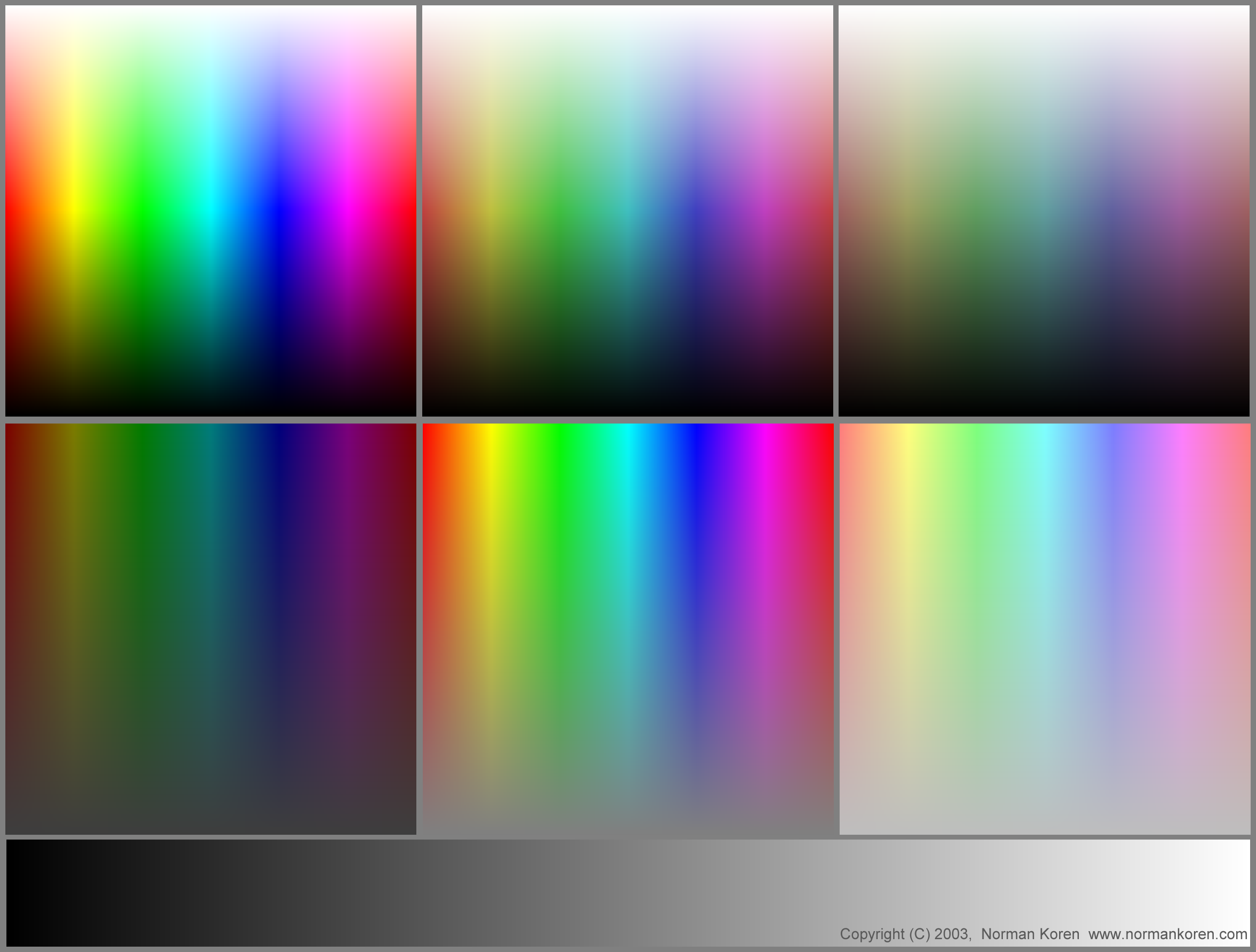
Download the full-sized chart, suitable for printing, as a 400 kB high quality color JPEG with no embedded ICC profile by shift-clicking here. Windows systems assume sRGB color space (gamma = 2.2). If you prefer to work in a different color space, such as Adobe RGB (1998), I recommend that you add an embedded profile without changing the data, which is pure numeric. Be particularly careful if you convert to a profile with different gamma (any of the Apple profiles); this can alter the levels in the step charts.1. All fully saturated colors (SHSL=1) in HSL space. Hue (H) increases from 0 to 1 (Red - Yellow - Green - Cyan - Blue - Magenta - Red) along the horizontal axis. Lightness (L) increases from 0 to 1 along the vertical axis. Square 1a is a reduced version of 1 (256x256 pixels) that can reveal edge effects that shouldn't be apparent in 1. See Light & color for more about HSL. The most saturated colors are along an imaginary horizontal line halfway up the chart (L=0.5). On this line, max(R,G,B) = 1 and min(R,G,B) = 0. Below the line, max(R,G,B) = 2L. Above it, min(R,G,B) = 2*(L-0.5), i.e., a white component is present.
1 is the most important of the color patterns. Compare the monitor image with the printed image. Most irregularities show up on this image, which is used in the Profile evaluations, below. Transitions should be smooth and gradual above and below the center (L=0.5).2. All colors achievable with L = 0.5 in HSL space, which is the level where maximum saturation takes place. H increases from 0 to 1 along the horizontal axis. Saturation (SHSL) increases from 0 to 1 along the vertical axis.2 rarely shows irregularities not apparent in 1, but it is still an important check.3. Kodak Q-13 Color Control Patches. The six boxes on the left illustrate the additive and subtractive primary colors at full saturation (S = 1; V = 1; L = 0.5) and at increased lightness (SHSL = 1; L = 0.875 or SHSV = 0.25; V = 1). The two pairs of boxes on the right don't correspond precisely to the original. This illustrates the primary colors-- the building blocks of all the others.3 can be compared with the Kodak Q-13 Color Control patches to provide an estimate of the purity of the primary colors, illustrated below.4. A full toned B&W image that should look excellent when the workflow is properly set up and calibrated. The image of Dead Horse Point, near Moab, Utah, was originally taken in color but converted into B&W using a red filter in software. This is mainly of interest in calibrating B&W images.5. Gamma 1.8 A step chart that closely approximates the Kodak Q-13 Gray Scale when printed with gamma = 1.8 (for older Macintosh systems; 2.2 seems to be the current standard). The numbers in each box are the normalized pixel levels. In two parts: the upper part is uncorrected. The lower (smaller) part is corrected for 1% viewing flare, or equivalently, a maximum print density of 2. Details below.
6. Gamma 2.2 A step chart that closely approximates the Kodak Q-13 Gray Scale when printed with gamma = 2.2 (for Windows systems). In two parts: the upper part is uncorrected. The lower (smaller) part is corrected for 1% viewing flare, or equivalently, a maximum print density of 2. Details below.
5 and 6 can be compared with the Kodak Q-13 Gray Scale to estimate print gamma, illustrated below.7. Linear 2 parts: Upper: A step chart with normalized pixel levels decreasing linearly from 1 to 0 in steps of 0.05 (unnormalized pixel levels decreasing from 255 to 0 with average step of 12.25, rounded). Valuable for identifying the precise level where density or tint needs correction. Lower: A continuous pattern, varying linearly from pixel level 255 to 0. This will reveal irregularities in the printer's grayscale rendition.8. White 255-240 A highlight discrimination chart with pixel levels decreasing from 255 (pure white), top center, to 240, bottom center. Pure white (255) on the left for reference. Alternating rectangles on the right (pixel levels 255, 242) to indicate positions. This chart shows the level where density first becomes visible on prints and monitors. 255 should be pure white. If levels below 254 are invisible on the print, you may want to consider (a) getting a better printer or printer profile (if you use color management), (b) not using more than one level where no image appears, or (c) bringing levels down in the Tint transformation.
Note: This page is still under construction.
 Reality
check Reality
check
How can I be certain the two color patterns in the above chart reveal all profile irregularities, even though it doesn't-- and can't-- contain all of the 16,777,216 (224) colors available with 24-bits? Because I ran several prints of the chart on the right, which includes several additional lightness and saturation levels, and the additional patterns didn't reveal anything that wasn't already apparent. Each of the patterns 1-6 varies hue (H) on the horizontal axis. For your own benefit, you can download the full-sized version, in a losslessly-compressed PNG format (only 135 kB), by right-clicking here.
|
|
 An
absolute
measurement of color purity is not possible from this image because the
colors are dependent on the scanner's imperfect response; you would
need
a spectrophotometer for this purpose. But you can make a good relative
estimate by comparing the scanned color patches from the print with the
Q-13. You can copy these images into your computer by right-clicking on
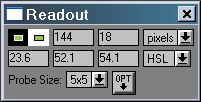
them. Use the eyedropper (right, for Picture
Window
Pro) to find the values in HSV,
HSL, or RGB representation. Green appears to be the weakest color
for
the 2200: (H,S,L) = (23.6, 52.1, 54.1) (expressed in percentage). It is
also the trickiest color to evaluate because the green on the Q-13,
(H,S,L)
= (37.2, 40.5, 42.1), is darker than the scanned or calculated green,
(H,S,L)
= (33.3, 100, 50). But the green in the 2200 may not be as bad as it
looks.
It's actually more saturated than the Q-13, but it does have a
Hue
error-- a shift towards yellow. You can only draw firm conclusions by
looking
at prints directly and comparing printers against each other. All
printers
have gamut limitations. We
may
want perfection, but we can't expect it.
An
absolute
measurement of color purity is not possible from this image because the
colors are dependent on the scanner's imperfect response; you would
need
a spectrophotometer for this purpose. But you can make a good relative
estimate by comparing the scanned color patches from the print with the
Q-13. You can copy these images into your computer by right-clicking on
them. Use the eyedropper (right, for Picture
Window
Pro) to find the values in HSV,
HSL, or RGB representation. Green appears to be the weakest color
for
the 2200: (H,S,L) = (23.6, 52.1, 54.1) (expressed in percentage). It is
also the trickiest color to evaluate because the green on the Q-13,
(H,S,L)
= (37.2, 40.5, 42.1), is darker than the scanned or calculated green,
(H,S,L)
= (33.3, 100, 50). But the green in the 2200 may not be as bad as it
looks.
It's actually more saturated than the Q-13, but it does have a
Hue
error-- a shift towards yellow. You can only draw firm conclusions by
looking
at prints directly and comparing printers against each other. All
printers
have gamut limitations. We
may
want perfection, but we can't expect it.
|
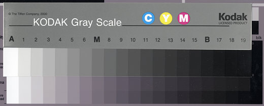
When the B&W test chart is printed 9.08 inches (23.1 cm) long (0.96 inch borders on 11 inch long paper), the steps align with the Q-13. This makes it easy to observe tonal errors and metamerism (change in print tint under different light sources), by comparing the print with the neutral gray Q-13, which has little, if any, metamerism. The print appears more magenta than the Q-13 under the cold light of the Epson 2450 scanner. The print and Q-13 are much closer under halogen light.
Viewing flare is stray
light
from the environment (room illumination, monitor illumination bouncing
off clothing, etc.) that tends brighten dark areas of monitor images,
reducing
overall contrast. Viewing flare is also present in prints, where it is
caused by reflected light from the front surface of photographic
emulsions.
It can be severe in matte photographic prints, but less so in matte
inkjet
prints, where there is no emulsion. The lower portions of the step
charts
for gamma = 1.8 and 2.2, to the right of "1%
flare corrected,"
are corrected for monitor viewing flare equal to 1% of the white level.
This is equivalent to a maximum print density of 2.0. 1% viewing flare
is typical, although it can vary widely. These regions are useful for
comparing
monitor images and prints. If you compare the Q-13 to a printout of the
chart, it should fall between the uncorrected and corrected portions
for
the appropriate gamma. On my 2200, the Q-13 is closer to corrected
steps
17-19 (densities 1.7-1.9).
| The
normalized pixel levels in the step charts for gamma = 1.8 and 2.2 are
derived from the equations, luminance = L = (pixel/255)gamma
+ black level, with black level assumed to be 0 (no viewing flare), and
density = d = -log10(L). This results in
pixel
= round(255*10-d/gamma), where round denotes round to
the nearest integer. Normalized pixel level = pixel/255 ~= 10-d/gamma.
As a result of gamma, contrast is much lower at low luminance levels
(high
densities). For example, for gamma = 2.2, luminances for normalized
pixel
levels 0.95 and 0.05 are 0.8933 = (1-0.1067) and 0.00137, respectively,
i.e., the contrast for the highest 5% of pixels is 78 times that of the
lowest 5%.
Black level is a complex issue. In monitors it depends on the Black level (Brightness) setting and the ambient light, which results in viewing flare. In prints it depends on paper (it is lower for glossy surfaces), ink, ICC profiles, and viewing conditions. For this reason, you should not expect the match between the monitor and the uncorrected steps in the print at low luminance levels to be precise, but it should be close enough so the print matches your aesthetic intent. The steps corrected for viewing flare = 1% (0.01) are calculated assuming black level = 0.01. With L = luminance (no flare) and Lf = luminance (with flare), Lf = 0.99L + 0.01 (normalized to 1) = 0.99(pixel/255)gamma + 0.01; L = (Lf - 0.01)/0.99 is used in the calculations. Density (with flare) = df = -log10(Lf ) takes the same values as d. pixel/255 ~= (10-df - 0.01) / 0.99)1/gamma. |
I scanned the print (the entire image) at 300 dpi with the Epson 2450 scanner. In Configuration, Color, I checked Color Controls with the Continuous Auto Exposure. I would have preferred ICM with Epson Standard as source and sRGB as destination profiles, but the results weren't as good. Unsharp mask was off. In Picture Window Pro, I applied the Levels and Color transformation to the image, setting Full Range. I cropped pattern 1 tightly and resized it to 440 pixels wide. The results are shown below for the original pattern and for scanned prints with two different ICC profiles. There are clear and obvious differences in the profiles.
Results:
|
|
|
Paul Holman uses these techniques to evaluate profiles. He offers custom profiles.
Note: This page is still under construction.
|
|
|
|
|
|
|
|

| Images and text copyright © 2000-2013 by Norman Koren. Norman Koren lives in Boulder, Colorado, where he worked in developing magnetic recording technology for high capacity data storage systems until 2001. Since 2003 most of his time has been devoted to the development of Imatest. He has been involved with photography since 1964. |  |