Image
editing with Picture Window Pro:
Contrast
masking
by Norman
Koren
updated January 28,
2004
.
| This page
illustrates contrast masking-- a technique adapted from the conventional
darkroom for balancing shadow and highlight regions of an image while maintaining
good contrast in each. |
Introduction:
Contrast masking the old way
Color transparencies (slides) look beautiful when projected, but their
high contrast can make them difficult to print. Shadow and highlight detail
is often lost on standard photographic papers. Detail can be maintained
by printing on low contrast papers, but the resulting prints can be quite
dull. Contrast masking was developed to deal with this issue; with a contrast
mask you can make prints with excellent detail and contrast in both
shadows and highlights.
In the wet darkroom contrast masking was difficult and tedious. It is
described in a page from The
Light Room. The essential process is as follows.
-
Expose a sheet of Black & white negative film behind the transparency.
Leave a little spacing or add a layer so the image on the B&W film
is slightly out of focus. A special film (Kodak Pan Masking film, now discontinued)
with high intrinsic contrast and no anti-halation layer was used. This
allowed light to scatter in the emulsion, softening the mask.
-
Develop it for rather low maximum density (Dmax). The negative is darkest
where the transparency is lightest.
-
When you print, sandwich it with the original transparency, taking great
care with registration. The combined image has much less contrast than
the original transparency. Adjust the print exposure to compensate for
the mask.
The contrast mask tends to leave an image unchanged near mask boundaries.
It lightens shadow regions and darkens highlight regions away from boundaries.
Its effect depends on the mask exposure, which determines boundary locations,
its development, which determines the degree of contrast reduction, and
the amount of blur. It isn't easy to control with traditional techniques..
Contrast masks can make an image appear sharper because then enhance
contrast at edges relative to the image as a whole. They are the origin
of the "Unsharp Mask."
Even though Kodak has discontinued its Pro Masking film, you can still
do contrast masking in the traditional way with a kit from RADEKA
photography. Their page has some impressive B&W examples.
But contrast masking is ever so much nicer and easier when done digitally.
And contrast masking isn't just for color slides-- it can benefit images
from any source-- black & white or color; film or digital.
Contrast
masking with Photoshop
In December 2000 Richard
Pahl of PCPhoto
published an article on contrast masking with Photoshop. His technique
has been adapted by Michael
Reichmann of Luminous-Landscape.com
and Uwe
Steinmueller of Outbackphoto.com.
with superb results. Ake
Vinberg and Nick
Thomas have also written well-illustrated articles.
The technique is as follows.
-
Click on Layer,
Duplicate
Layer or Right-click on the image name in the Layers
palette and select Duplicate Layer.
Give the new layer a distinct name like Contrast
mask.
.
-
Select the new layer and click on Image,
Adjust,
Desaturate
to make it into a grayscale image.
.
-
Click on Image,
Adjust,
Invert
to create a negative of the grayscale image.
.
-
In the Layers palette, set the box on the upper left (Blending
mode in Layer, Layer
style, Blending Options) to
Overlay.
Set Opacity to about 80%. You can fine
tune it later. (Michael and Uwe differ in the order and details of this
step.)
.
-
Click on Filter, Blur,
Gaussian
Blur to blur the mask layer. Adjust Radiusfor
the desired effect, which will be visible. A good starting point is 1%
of the average image dimension in pixels (e.g., 25 for a 2000x3000
pixel image). Values between 10 and 100 are typical.
The full technique, with illustrations and additional detail, is presented
in the pages by Richard
Pahl, Michael
Reichmann, and Uwe
Steinmueller. The results are beautiful. To me, this technique seems
a bit convoluted, worthy of Rube
Goldberg, though it's no more complex than the technique I present
below. Its main problem is that it is quite restricted. As you'll see,
my approach is far more flexible.
.
| Contrast
masking and visual adaptation |
| When your eye wanders around a natural scene
it constantly adapts to changes in brightness and contrast. But when you
look at a print your eye adapts very little; mother nature's visual cues
are absent. Prints have a more restricted tonal range than natural scenes:
about 100:1 at the most. This discrepancy must be dealt with in making
prints. Contrast maskingis
one of the most effective means.
Contrast masking simulates the eye's adaptation
in a natural scene: it lightens dark areas and increases their contrast;
it darkens light areas and enhances detail. Overall contrast is boosted
near boundaries: dark areas appear darker and light areas appear lighter
than they do at a distance from the boundaries. Boundaries appear natural
if an appropriate mask blur radius is chosen. This is a matter of experience.
The wonderful thing about digital editing is that you acquire experience
very
quickly. |
|
Contrast
masking with Picture Window Pro
 The
new technique is similar to the old in that you create a mask--
a blurred monochrome image based on the tones of the original image. But
the process for creating it is far more flexible. The mask is also used
differently. Instead of combining it with the original image (which you
can do with Picture Window Pro's Composite
transformation), you use it to select portions of the image to be adjusted
with transformations.
This gives you immense power and control.
The
new technique is similar to the old in that you create a mask--
a blurred monochrome image based on the tones of the original image. But
the process for creating it is far more flexible. The mask is also used
differently. Instead of combining it with the original image (which you
can do with Picture Window Pro's Composite
transformation), you use it to select portions of the image to be adjusted
with transformations.
This gives you immense power and control.
The first step in making a contrast mask is to take a close look at
the image and decide what you want to accomplish.
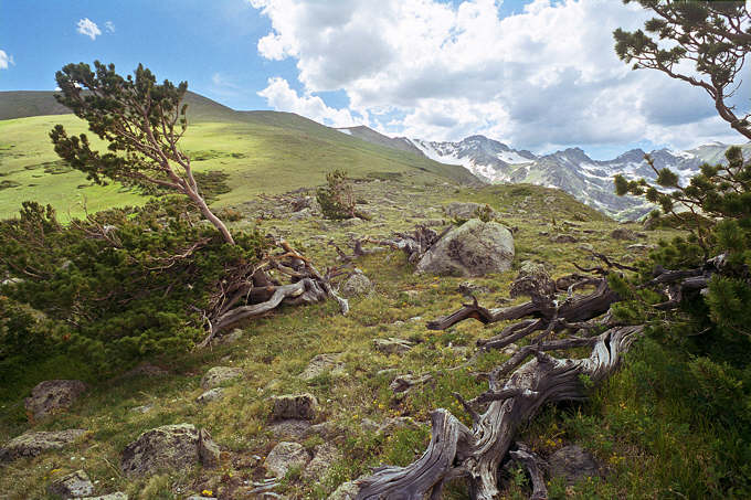
We use the image of bristlecone pines on the Arapahoe Glacier trail
as an example. I often return to this spot, at timberline in the Indian
Peaks Wilderness, an hour's drive and a 90 minute hike (less if you're
young and fit; I'm 59) from Boulder. The light is always changing and often
magical-- enough to lighten the burden of schlepping heavy camera
gear at 11,000 feet (3300 meters). I like the composition-- I got a dynamic
element that I don't often get, but it is difficult to print. The sky is
very light, and the foreground is rather flat and dark. The goal is to
bring the foreground to life by boosting its contrast, along with highlights
and color saturation, and to darken the sky. The foreground will be mostly
unmasked and the sky mostly masked. (Which portion of the image is masked
and which is unmasked is entirely arbitrary.) As you'll see, masks don't
have to be perfect. The Color Curves
transformation overcomes small mask imperfections.
In the past I tried to make a rather sharp mask to delineate the foreground
and the sky. It was tricky, especially around the snow patchesm and it
required a lot of manual touchup. It's much easier with the contrast masking
technique-- I didn't do any manual touchup. And the results are
more pleasing.
1.
Create a mask based on image brightness.
If you are not familiar with making masks in Picture Window Pro, look at
the tutorial, Making and using masks.
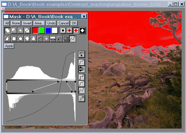
To create the mask, select the input image and click the mask icon or Mask, New.
Select the Brightness Curve tool
or Mask, New.
Select the Brightness Curve tool  ,
then click on the Show Histograms icon
,
then click on the Show Histograms icon .
Since I want to adjust the foreground and sky separately I add two control
points by shift-clicking on the bar below the upper histogram. I move the
arrows as indicated, then click Apply
to see the results. If I'm not satisfied, I click None,
adjust the control points, then click Apply
again. An opaque mask overlay is illustrated. I often switch between mask
overlay displays: Clear (none)
.
Since I want to adjust the foreground and sky separately I add two control
points by shift-clicking on the bar below the upper histogram. I move the
arrows as indicated, then click Apply
to see the results. If I'm not satisfied, I click None,
adjust the control points, then click Apply
again. An opaque mask overlay is illustrated. I often switch between mask
overlay displays: Clear (none) ,
Semitransparent
,
Semitransparent ,
Opaque
,
Opaque ,
or Mask only
,
or Mask only .
.
 This is the appropriate time to apply manual adjustments if they're needed;
I didn't apply any for this image.
This is the appropriate time to apply manual adjustments if they're needed;
I didn't apply any for this image.
You will need to blur the mask. There are three approaches.
-
Blur the mask using Blur
 ,
Apply,
then OK to save it.
,
Apply,
then OK to save it.
.
-
Save the unblurred mask by clicking OK
and blur it later with the Blur transformation,
as illustrated in step 2. This approach allows you
to keep the original sharp mask in case you decide to use a different blur
radius.
.
-
Take advantage of a nifty feature of PW Pro's mask
transformation: You can combine steps 2 and 3
by performing a transformation while the Mask dialog is active, before
you press OK.
Blur the mask using Blurwith
an estimated Radius, then click Apply.
Make sure the image is selected, then select and perform the transformation,
in this case, Color Curves, as you
normally would. The effects of both the mask and transformation shows up
immediately in the Preview window, which you can enlarge as needed. You
can switch between the transformation and mask dialog boxes, making changes
in each until you get it right. The Undo
function of the Mask dialog box is particularly valuable at this time.
If the radius isn't optimum, click Undo
and perform a Blur with a different Radius. This is a very powerful
technique. Unfortunately, your can do this on only one transformation.
You'll have to save the mask and use it as indicated in step
4.
Using curves is a powerful technique for creating masks. If you keep the
mask linear-- if you don't add any control points-- the results, apart
from the blurred mask area, won't be different from using Brightness
Curve or Color Curves without
a mask.
.
| Histograms
and curve transformations |
| The Brightness Curve tool in the
Mask
transformation (above) and the
Brightness
Curve and Color Curves transformations
(below) allow you to adjust curves aided by histograms--
charts that display the distribution of tones (also hue, saturation, or
RGB colors for Color Curves). The x-axis
of the histogram represents values 0-255 (minimum to maximum). I prefer
to use them with the Show Histograms
diaplay. In this display, the upper and lower histograms represent the
distributions before and after the transformation, respectively. The control
points (the ends of control lines) control the mapping. Control points
are added by shift-clicking on the bar below upper histogram; they can
be deleted by control-clicking. Once added, they can be moved freely along
either bar.
The selection of control points is a matter of judgment and experience.
In the mask building step (above), you use them to select which areas will
be masked fully, partly, or not at all. In the tonal adjustments (below),
you use them to adjust the tones in the region selected by the mask. In
both cases, carefully observe the Preview image to see the effects. If
Auto
is checked (Default Preview is set
to Auto in Preferences),
the Preview window is updated whenever an adjustment is altered. You'll
gain experience quickly. I almost invariably make sure some portion of
the shadow region contains pure black (level 0). The histogram is invaluable
for finding the black points of the input and output images. I use the
Preview image for most other aspects of tonal adjustments.
To learn more, read Jonathan Sachs' tutorial, Using
curves and histograms. |
|
2.
Blur the mask.
Select the (unshapened) mask and click Transformation,
Blur.
In Method: select Gaussian.
Leave Threshold at 100%. Select an
appropriate Radius. Typical values
are 1 to 2% of the of the average image dimension in pixels. I chose a
Radius
of 40 for the 2998x2000 pixel input
image (shown greatly reduced, of course). See the box below for more on
selecting Radius. The Mask
transformation Blur tool is identical
to Gaussian Blur with Threshold
= 100%.
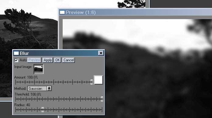 Click OK. The blurred mask, shown in
the Preview window on the right, above, is the contrast
mask.
Click OK. The blurred mask, shown in
the Preview window on the right, above, is the contrast
mask.
| Blur
Radius: a key decision |
| Blur Radius strongly affects the
appearance of the final image. Contrast masking typically enhances contrast
near boundaries-- dark areas are darker and light areas are lighter than
they are at a distance from the boundaries. Radius
determines that distance. Ultimately, your choice will be based on your
own feeling, experience, and aesthetic judgment. There is no hard and fixed
rule. The choice is affected by the initial boundary contrast, boundary
sharpness, the degree of manipulation required, and, to a lesser degree,
the size of the final print.
The only rule is that you must observe the final image with clarity
and mindfulness-- especially the boundaries. If they looks artificial or
displeases you in any way, don't be afraid to go back and create a new
contrast mask with a different blur Radius. Eschew laziness. You can use
the following trick to get the Blur Radius just right. |
|
3.
Transform the foreground using the mask.
In both classic contrast masking and the Photoshop
approach the mask is combined with the image. The result can be pleasing,
but it's not the best. The mask tends to obscure the image and limit adjustment
flexibility. It is far better to use it to control the portion of an image
that receives a transformation. Several transformations, including Levels
and Color, Brightness Curve,
and Brightness can do the job, but
Color
Curves is the most powerful. It allows us to attain our goal precisely:
to boost foreground contrast, along with highlights and saturation.
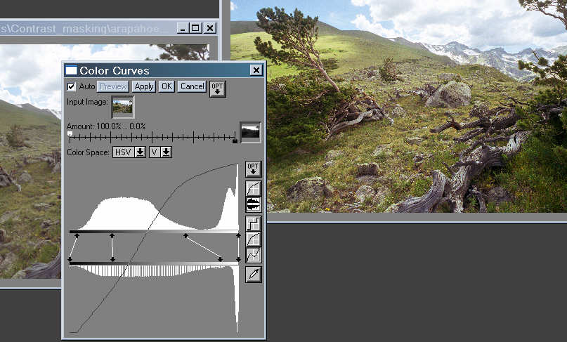
Select the input image and click on Transformation,
Color,
Curves...
Select the mask in the window to the right of Amount.
The Amount sliders will be in their
default positions: white (the masked region) will be 100% and black (the
unmasked region) will be 0%. Since the foreground is unmasked (dark in
the mask), reverse them. Add control points by shift-clicking on the bar
below
the upper histogram, and adjust them for the desired appearance in the
Preview window, shown on the right in the illustration below. I chose two
control points for this image-- the minimum that produced the effect I
wanted. I chose HSV
color space because it tends to increase saturation as the image is lightened.
I also increased Saturation slightly (in the S
window, not shown, to the right of Color Space).
 The gaps in the lower histograms, above and below, are the result of the
24-bit math used for the preview calculation. If you are editing a 48-bit
image, the gaps will be gone after the transformation is complete; the
transformation itself is performed with 48-bit precision. That's why I
recommend editing in 48-bits.
The gaps in the lower histograms, above and below, are the result of the
24-bit math used for the preview calculation. If you are editing a 48-bit
image, the gaps will be gone after the transformation is complete; the
transformation itself is performed with 48-bit precision. That's why I
recommend editing in 48-bits.
If you combined steps 2 and 3 by applying the
Color Curves transformation with the Mask transformation active, you must
now save the mask by clicking OK in
the Mask transformation dialog box.
4.
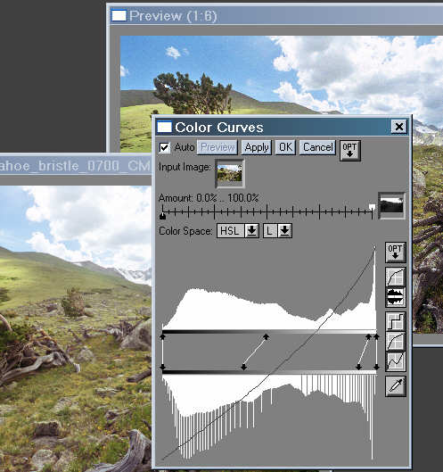
Transform the sky using the mask.
The procedure for adjusting the sky is similar to the procedure for the
foreground, but reversed.
Select the input image and click on Transformation,
Color,
Curves...
Select the mask in the window to the right of Amount.
Leave the Amount sliders in their default positions: 100% for white (the
masked region) and 0% for black (the unmasked region). Add two control
points by shift-clicking on the bar below the upper histogram and adjust
them for the desired effect. I chose HSL
color space because it tends to increase saturation as the image is darkened. |
 |
4A. Alternative approach
to enhancing the sky
Use Filter instead of Color
Curves. Select the mask as above. Use the original image in the
Filter box instead of a pure color (the normal approach). Keep Method
on Additive (the default). This may
be suggested somewhere in the PWP manual. This approach effectively doubles
image contrast and saturation (less if you turn down the Amount
slider).
 Thanks to Ted Kostek for the suggestion. He states, "I have a few photos
where the impact on the sky was beathtaking. All of a sudden my puffball
clouds became full of subtle detail and the saturation in the blue areas
jumped as well."
Thanks to Ted Kostek for the suggestion. He states, "I have a few photos
where the impact on the sky was beathtaking. All of a sudden my puffball
clouds became full of subtle detail and the saturation in the blue areas
jumped as well."
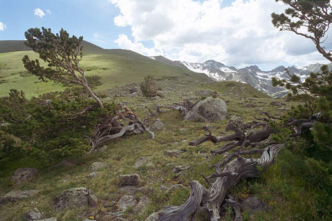
The result (almost
final)
Here is the result of the transformations; image editing is almost complete.
To complete it I would make small adjustments to the color balance of the
foreground and the sky, and I would sharpen the foreground using Unsharp
Mask. That's it. The contrast mask did an amazing job of balancing
this difficult-to-print image-- it didn't require any manual manipulation--
small area adjustments with tools or with manually-drawn masks. That is
rather unusual. I'll probably find a few small details to touch up.
Contrast masking is a rather
simple process if you are familiar with masks
and transformations in Picture
Window Pro. It works best with images that have significant dark areas,
such as shaded foregrounds, and significant light areas, such as skies,
with different illumination from the dark areas. Just create a mask based
on image brightness, blur the edges, and use it to control transformations
that adjust brightness and contrast in dark and light regions (Color
Curves is the most powerful for this purpose). The results of applying
a contrast mask can be impressive: it often does such a good job that little
or no additional manual adjustment is required.
.
|
Images
and text copyright (C) 2000-2013 by Norman Koren. Norman Koren lives
in Boulder, Colorado, where he worked in developing magnetic recording
technology for high capacity data storage systems until 2001. Since 2003 most of his time has been devoted to the development of Imatest. He has been involved with photography since 1964. |
 |