Understanding
image sharpness part 8:
Grain
and sharpness in scans and enlarger prints
by Norman
Koren
updated
November 23, 2003
In this page we compare grain and sharpness for three
scanners with a well-crafted enlarger print, and we look at grain aliasing
and software solutions.
| Green is for
geeks. Do you get excited by an elegant equation? Were you
passionate about your college math classes? Then you're probably a math
geek-- a member of a maligned and misunderstood but highly elite fellowship.
The text in green is for you. If you're normal or mathematically challenged,
you may skip these sections. You'll never know what you missed. |
Grain
Grain is a blessing and a curse. Film images are composed of grain, but
grain degrades image quality in the eyes of most viewers. As I indicated
in Part 1, grain corresponds to
noise
in a communication system, while MTF corresponds to bandwidth.
"Fine-grained" isn't necessarily the same as "sharp." Grain is a random
process that can be roughly characterized by
two parameters-- average
grain size and RMS (root mean square; a common
statistical measure) density variation (amplitude). For this
reason, there is no single quantitative measure of noise.The visibility
of grain depends on viewing magnification. Kodak's
Print
Grain Index takes this into account. In spatial
frequency domain, grain has a broad spectrum with maximum energy between
1/(2*average grain size) and 1/(average grain size). Sharpening boosts
noise energy high spatial frequencies, while its inverse, blurring, attenuates
it.
Faster films tend to have larger grain-- grain vs. speed is a classic
tradeoff. Increasing development time, which increases image contrast,
also tends to increase grain size. The choice of developer affects the
grain structure-- mostly the RMS density variation. Black & White developers
span a spectrum from fine grain developers such as Microdol-X, which softens
both grain and image, to ultra-sharp developers such as Rodinal, that have
pinprick-fine grain and maximum image sharpness. Sloppy development-- poor
temperature control or depleted chemicals-- makes grain uglier: density
variation worsens and grains can clump.
Some people prefer sharp grain and choose developers like Rodinal to
emphasize it, but most people would be happy to be rid of it. At best they
regard it as a necessary evil. Grain tends to be most objectionable in
smooth areas like skies.
I wrote this page because I received one complaint too many about grain
in the CanoScan FS4000US 4000 dpi scanner.
The gist of the complaints was that scanned images looked significantly
grainier than camera shop prints; scanner noise and grain
aliasing were the suspects. The two most serious complaints involved
Kodak Gold 200 film. I decided to investigate by comparing a sharp print
with scans from my three scanners: the 4000 dpi CanoScan
FS4000US, the 2400 dpi Epson 2450
(to be replaced with the 3200 dpi model 3200), and the 2400 dpi Hewlett-Packard
PhotoSmart S20 (recently discontinued). I used a Black & White
print because I couldn't find a suitably sharp color print of my own making)
I also needed a fairly grainy image to observe grain
aliasing, which is rather elusive.
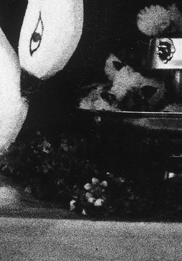
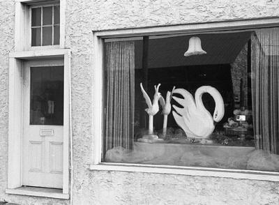
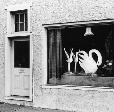
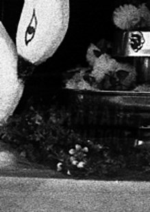
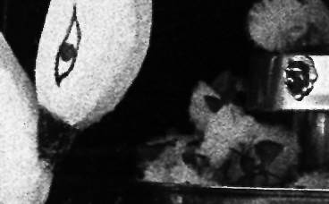
The
image
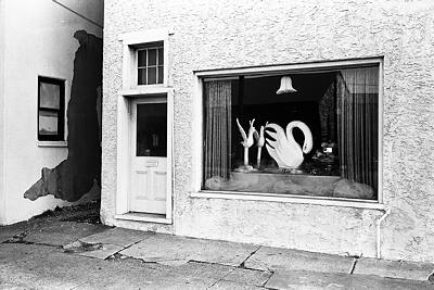 The
image I've chosen for the comparison is Swan Window, Phoenixville, Pennsylvania,
1972, part of a series of shop windows that express old-fashioned individuality--
that show no trace of the franchise-driven uniformity that blights our
cities and suburbs. It isn't earth-shaking, but it is well suited for the
comparison because it's extremely sharp, has a sharp but fine grain structure,
and has smooth areas where grain is plainly visible.
The
image I've chosen for the comparison is Swan Window, Phoenixville, Pennsylvania,
1972, part of a series of shop windows that express old-fashioned individuality--
that show no trace of the franchise-driven uniformity that blights our
cities and suburbs. It isn't earth-shaking, but it is well suited for the
comparison because it's extremely sharp, has a sharp but fine grain structure,
and has smooth areas where grain is plainly visible.
It was taken with a Leica M2 with a 1958
vintage chrome-barreled 35mm Summicron lens, at or near its optimum aperture
of f/8. A superb lens, even by today's standards. The film was Ilford FP-4,
developed in Edwal FG7 diluted 1:15 in a 9% sodium sulfite solution. I
used that combination of film and developer because it was extremely sharp,
had moderate grain and a nice tonal scale. The grain is tight but has rather
high amplitude (density variation) compared to typical color images.
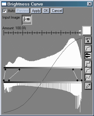
The above image was scanned at 4000 dpi in 16-bit B&W on the Canon
FS4000US, boosted in contrast using Picture Window's Brightness Curve transformation
(below, right), resized to 400 pixels wide, then saved as a moderately
high quality JPEG. The original scan settings were optimized to capture
detail over as wide a tonal range as possible. Contrast was boosted to
approximately match the print. I didn't take the trouble to match the print
exactly
because it was evidently dodged (lightened) in the window area and burned
(darkened) at the top and bottom; it would have been too time-consuming
to do this with the all the scans (no problem doing this for a fine print).
The print is pretty snappy-- quite a lot of the shadow detail had to be
sacrificed. For reference, a portion of the image with original tones (as
scanned) and the Brightness Curve transformation are shown below.
 Original contrast (above) before contrast boost (right)
|
 |
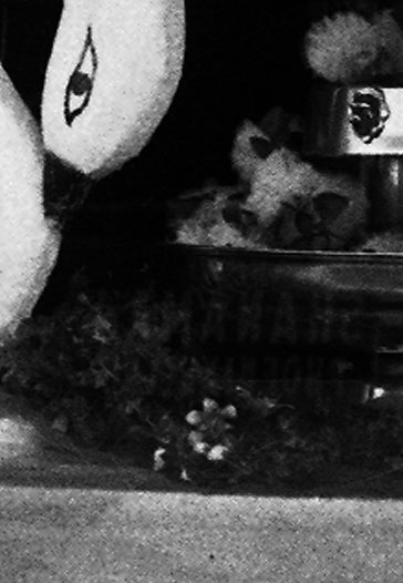
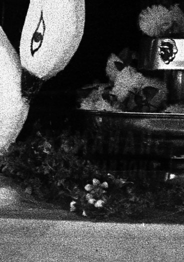
The
print
| The print was made on a Leitz Focomat 1c enlarger with a 50mm f/2.8
El Nikkor enlarging lens stopped down to f/8 (optimum aperture). Every
effort was taken to make it as sharp as possible. The Focomat has anti-Newton
ring glass above the film (one side only) to keep it from shifting during
the exposure. A well-calibrated Thomas Scoponet (aerial image) focus magnifier
was used to verify the image sharpness, and the enlarger had been adjusted
so the film carrier, lens, and easel planes were precisely aligned. I was
a fanatic printer-- absolutely hardcore-- a trait that hasn't changed.
I loved it, and still do, when experienced photographers thought I was
using medium format.
The full frame 24x36mm negative was printed 7.6x11.4
inches (194x291 mm; 8.08x
magnification) on 11x14 inch Agfa Portriga Rapid glossy paper, selenium
toned. The central portion of the print, shown on the right (reduced),
was scanned in Black & White at 600 dpi on the Epson 2450 with Unsharp
Mask. At 600 dpi, the image is not affected by scanner limitations. At
a print magnification of 8.08x, this
is equivalent to 4848 dpi on the negative. I resized it to the equivalent
of 4000 dpi for comparison with the CanoScan FS4000US, then I sharpened
it so the grain and sharpness appear identical to the print viewed through
a 10x loupe. |
|
 |
Grain/sharpness
comparison
At a monitor resolution of 80 pixels per inch (fairly typical), the entire
image would be 70.3x47.1 inches (178x120
cm): almost 50x magnification. The
print doesn't look grainy from normal viewing distance, but you can see
it clearly under a magnifier.
.
Original print, 8.08x magnification,
scanned at 600 dpi and resized with sharpening.
|
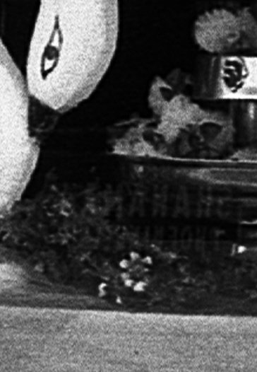
CanoScan FS4000US, 4000 dpi.
Scanned with
FilmGet, which does moderate sharpening.
 |
Hewlett-Packard PhotoSmart S20, 2400 dpi,
sharpened with Unsharp Mask (with threshold),
resized
|
 Epson 2450, 2400 dpi, scanned Epson TWAIN 5,
which has aggressive Unsharp Masking,
resized.
|
|
.
Observations
-
The scans from the print (made in the 1970's) and
the 4000 dpi CanoScan FS4000US are remarkably similar. I believe the FS4000US
has very slightly more detail, but the difference is hardly significant.
I did no sharpening with the CanoScan scan beyond what was done by FilmGet
at scan time. The swan's head in the print appears less grainy because
it was dodged (lightened).
-
The 2400 dpi HP S20 is not as sharp as the print
or FS4000US, but it's close, as I would expect from simulations.
Its grain appears low because the HP scanning software at the default setting
does very little sharpening. Unsharp Masking with a threshold to avoid
sharpening low contrast regions (i.e., grain) was applied in the image
editor.
-
The 2400 dpi Epson 2450 was less sharp than the HP
S20. Using the procedure below, I determined that it is about equivalent
to a 1600 dpi dedicated film scanner. The reason is apparently the optical
system and/or the CCD sensor, not the diffuse
light source, which I discuss in the page on scanners.
Epson
2450 equivalent resolution
| The Epson 2450 flatbed scanner scans at the same 2400 dpi "resolution"
(actually, scanning density) as the HP S20, but its image has less detail
than the S20 and larger grain than any of the other scans. I was able to
determine that the 2450 is equivalent to about a 1600 dpi scanner with
the following procedure.
I resized the sharp Canon FS4000US scan (upper right in the comparison,
above) to the equivalent of 1600 dpi, resized it again to 2400 dpi, then
sharpened it so it appears similar to the original Epson 2450 scan. 1600
dpi was closest to the original scan. I couldn't obtain as much detail
at 1200 dpi, and there was notably more detail at 2000 dpi.
I must add that the 2450's large apparent grain is not
the result of grain aliasing. It is the result
of the 2450's low sharpness, which softens both the image and grain, and
hence emphasizes low spatial frequencies. |
|
 Epson 2450, 2400 dpi, USM,
original size
|
 Simulated 1600 dpi scan.
USM to match 2450
|
|
Grain
aliasing
Grain aliasing is a complex effect that increases the apparent grain size
in some digital scans-- it makes individual grains larger and uglier than
on comparable darkroom prints. I became aware of it in an article
by Pete Andrews, whose defensive tone made it evident that the subject
is controversial. The cause of grain aliasing is clear, but identifying
it-- distinguishing it from plain unaliased grain-- is not easy. The only
way to be certain is to compare a scan with a sharp print of the same image
(a 4x6 inch camera shop prints is rarely
good enough).
How to
identify grain aliasing
| Appearance
of the scan compared to a well-made darkroom print |
|
The
cause is... |
| Grains
are larger with overall rough appearance. Structure is different. |
|
Grain
aliasing |
| Grains
are larger but soft in appearance. Structure is similar. |
|
Blurring
(misfocus, etc.) |
| Grains
are smaller and sharper. Structure is similar. |
|
The
scan is fine. The darkroom print is misfocused. |
|
Grain aliasing appears when two conditions are met.
-
The scanner must have significant response above the Nyquist frequency
fN
,
which is defined in the box, below. Since most scanners
have little response above the first null, located at 2 fN ,
the critical region is between fN
and 2 fN
.
In practice this means the scanner will produce sharp images for its dpi
rating.
-
The grain pattern must have significant energy in the critical region above
the Nyquist frequency, between fN
and 2 fN
.
This is not easy to determine by eye. ASA 200 negative film may, for example,
have worse grain aliasing than ASA 100 film (which has fine grain that
may have low RMS density variation) and ASA 400 film (which has large grain
whose spectral peak may be below fN ). Pete indicated
that the appearance of grain aliasing is capricious-- hard to predict;
it could be affected by development, not just the film type. I concur.
I could find no grain aliasing with any of my three scanners in normal
operation. To see it, I had to stress the Epson 2450 by scanning a grainy
1974-vintage color negative at 300 dpi.
Grain aliasing in the Epson 2450 scanner
 |
 |
 |
 |
| 1. |
2. |
3. |
4. |
-
is the original medium format image, taken in 1974, when Kodacolor film
was a lot grainier than it is today. The portion on the right shows the
contrast as scanned. The portion on the left illustrates the extreme contrast
boost required to see grain aliasing.
-
is a portion scanned at 2400 dpi with boosted contrast. What you see is
the original grain on steroids (extra contrast).
-
is a portion scanned at 2400 dpi with boosted contrast, resized to the
equivalent of a 300 dpi scan using bicubic interpolation, then sharpened.
Bicubic interpolation contains implicit anti-aliasing. No grain is visible.
-
is a portion scanned at 300 dpi with boosted contrast. Grain aliasing
clearly is clearly observable in the sky. It would have been almost
invisible without the contrast boost.
|
Grain aliasing is observable in the 300 dpi scan because the Epson apparently
scans every 8th position, without anti-aliasing. This reduces the
Nyquist frequency by a factor of 8, but doesn't affect the sensor response;
hence there is huge response above Nyquist. Grain aliasing was less obvious
in 600 and 1200 dpi scans.
Observations on grain aliasing-- I had a difficult time observing
it with any of my scanners, even at 1/4 the maximum optical scan density.
The evidence that the CanoScan FS4000US has no grain aliasing is the similar
grain structures in scan and the enlarger print. The HP S20 and Epson 2450
both have somewhat larger, softer grain structures, not caused
by grain aliasing. It is caused by the response of these scanners, which
softens both the grain and the image, emphasizing lower spatial frequencies.
If you haven't worked with fine darkroom equipment or haven't purchased
well-made custom prints, you may not realize how grainy film can be (negative
film is grainier than slide film). Grain aliasing and scanner noise are
often blamed for grainy appearance, when, in fact, straight unaliased film
grain is the cause.
Nevertheless, grain aliasing is a real effect worth watching for. I
believe Pete saw
the real thing: if his 2700 dpi Acer
Scanwit 2720 scanner had an optical system as good as the 4000 dpi
CanoScan
FS4000US, it would have sufficient response above the Nyquist frequency
(1350 lp/ inch = 53 lp/mm) to make it susceptible to grain aliasing. Dave
Miller of Beckenham, Kent, England, lends support to this theory. Images
scanned from color negatives on his 2700 dpi Acer, especially ASA 200,
are unacceptably grainy.
| Film
grain-- summing it up |
| Film
images are composed of grain, and film (especially negative film) can have
more grain than most people realize, especially if they haven't seen sharp
prints. Film grain is often mistaken for scanner noise or grain aliasing
(a real effect, but somewhat rare). |
|
Now the good news. You
can reduce grain in software.
Software
solutions to grain
| The first line of defense is the Blur function found in most image
editors. Blur is often combined with a threshold to prevent it from blurring
edges. Here is the result of applying Picture Window Pro's Blur transformation
to the CanoScan FS4000US 4000 dpi scan (above,
right side). Method: was set to
Blur
More and Threshold: was set
to 29.8%. Threshold should be set as
low as possible to reduce grain while maintaining sharp edges. The entire
image is soft when Threshold: is set
to 100%.
Remember, this image is enlarged about 50x
on your monitor screen. Very little grain will be visible in a 13x19
inch print (about 13x magnification). |
 |
I owe a debt of gratitude to Greg
Brakefield (gbrakefield at cfl dot rr dot com, one of the Kodak Gold 200 grain sufferers) for getting
me to look more closely at grain reduction software. In October he wrote
me complaining about noise in his CanoScan FS4000US scanner. It turned
out to be film grain: The structure was identical in scans made with FilmGet
(Canon's software) and VueScan.
As soon as he realized that returning his scanner wouldn't help, he started
testing software. At first he tried demo versions of several Photoshop
plug-ins: Grain Surgery ($199), Quantum
Mechanic Pro ($199) and Noise
Reduction Pro ($99). His favorite was Noise Reduction Pro.
Then he discovered a standalaone program called Neat
Image. (Nicole
Vincent told me about it at the same time.) An amazing program. It
creates a noise profile by analyzing grain in untextured areas of the image,
then uses the profile to remove grain. You can control the degree of grain
removal and sharpening. Profiles can be saved for use with other images
made with same film/scanner combination-- not all images have untextured
areas suitable for profiling. The downside: it runs very slowly and there's
a learning curve. You may want to start a run before a meal or a coffee
break (tea on the other side of the pond). A dual-processor machine makes
it easier to perform other work during a run.
You can download a demo version-- very capable, but saves only in JPEG
format (not TIFF or BMP), by clicking here.
The basic instructions for getting started are here.
I'll eventually have more to say, but for now, here are Greg's tips:
After the usual
Levels and Color adjustments, I ran the corrected image through Neat Image
with outstanding results. The following procedure works well with FS4000US
scanned images .
-
Under the "Device noise profile"
Tab, pick a detail-free area, and run the "Rough noise analyzer" to analyze
it. Then pick several other similar textureless areas and use the "Fine
tune analyzer".
-
Under the "Noise filter settings"
tab, I usually leave the "Noise levels" section alone.
-
Under the "Noise reduction amounts"
section, I adjust the "Mid" and "Low" sliders in the to between 90% - 95%
(I try keep them equal). I make no adjustment to the "High" slider.
-
This step is CRITICAL to ensure
the images is not over-Filtered to the point that they have a "plastic"
look. In the same section (Noise reduction amounts), adjust the "Y" slider
to between 40% and 70% (I usually find that 45-60 is best). NOTE: This
appears to be the main control for determining how much overall filtration
is applied. In addition, adjust the "Cr" and "Cb" sliders (keep them equal)
to read 30% HIGHER than the "Y" slider.
-
Finally, in the "Sharpening
settings" section, I've been leaving "Y" checked, adjusting the "High"
slider to 60-70%, and adjusting the "Mid" and "Low" sliders to 10 - 20%.
The Key to determining the amounts
in step (4) is experimentation. Use your mouse to select an area in the
image to analyze, then use the various settings described above. Each time
you make a change to a slider, Neat Image will show the changes in the
box.
These settings are not etched
in stone; they are merely the ones that worked well with my images. If
you find better settings, please let
me (Greg) know. I'd be happy to send you examples if you like.
If the results in Neat Image's
website are any indication, it's well worth the effort. (They've done
quite a job on the grainy sail from the middle of Pete
Andrews' page.) Here is the result of running Neat Image on an image
taken with Kodak Gold 200 film and scanned at 4000 dpi on the CanoScan
FS4000US. the crop is magnified 1:1 (1 screen pixel per image pixel). The
settings are similar to Greg's. I reduced the Noise reduction amounts somewhat
from the defaults: Y = 50% and Cr = Cb = 80%, and I increased the sharpening:
110% for High (spatial frequencies) and 40% for Mid. Impressive
results!

Original
|
Processed by Neat Image
|
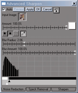
| The Advanced Sharpen transformation
in Picture Window Pro 3.5 does
an excellent job of removing grain while optimally sharpening the image.
It is described in detail in a PDF
manual.
Advanced Sharpen operates in three steps, shown in the dialog boxes
below. The histograms represent the differences
between neighboring pixel levels-- not
the pixel levels, as they normally do.
-
Step 1 blurs the image. The radius should be set fairly large for effective
grain removal. The sliders under the histogram have been set to prevent
blurring of high contrast edges.
-
Step 2 removes black or white specks that result from dust or film defects.
There was a problem with small white specks, which were visible after sharpening.
-
Step 3 sharpens the image with a precisely controllable Radius and Amount.
This allows you to find exactly the right value for sharpening without
creating "halos" near edges. In the standard Sharpen/Unsharp Mask transformation,
you can only set Radius in discrete steps of pixels: 1, 2, 3, etc. The
sliders below the histogram prevent low contrast areas from being sharpened.
To get the right setting I used quite a bit of trial and error, with the
Preview window set to 1:1 magnification.
In Opt
(options), I checked Sharpen
luminance only, because it gave a slightly more natural result,
and I checked High Histogram
Expansion. On large files, the Preview refreshes very slowly
when you move from Step 1 to 2 or 3 and Blur Amount is greater than 0.
On Canon EOS-10D images, where grain is pretty
minor, I leave Blur Amount at 0.
The result is excellent: grain removal and sharpness are comparable
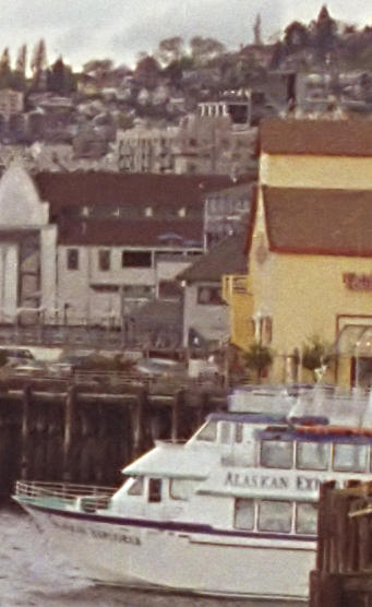
to Neat Image. But there's one area where Neat Image comes out ahead. It
does a better job of maintaining fine low contrast detail, for example,
in the railing on the pier above the boat. In general, Neat Image is my
tool of choice when the dominant defect is grain. But I regularly use Advanced
Sharpen with my Canon EOS-10D. I discuss
Picture Window Pro-- my favorite image editor-- here. |
 Processed by Advanced Sharpen
in Picture Window Pro 3.5
|
|
Picture Window Pro 3.5 Advanced Sharpen dialog boxes, illustrated
for each of the three steps.
Step 1: Blur
|
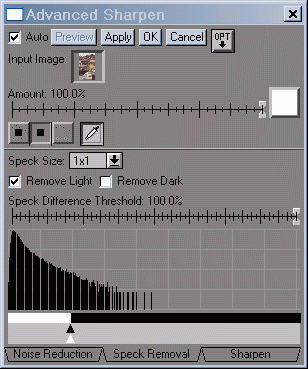
Step 2: Speck removal
|
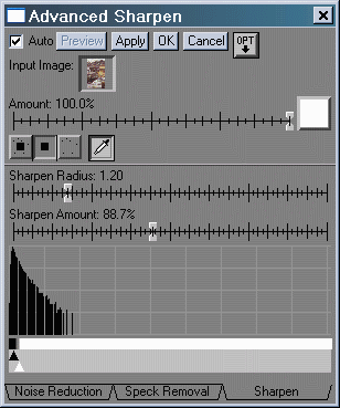
Step 3: Sharpen
|
Another Neat Image example--
Dr. P. K. Roy of Durgapur, West Bengal, India sent me this image of his
late mother, himself (lower left), and his little brother, taken around
1950. It was scanned from a print made on rough textured paper. I cropped
it to save bandwidth. I trained Neat Image on a portion of the background
on the upper left, not shown in the crop. It did a near miraculous job
of reducing the texture while maintaining important detail.
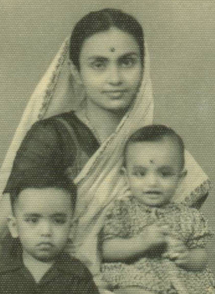 Original
|
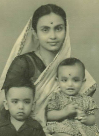 Processed by Neat Image
|
Neat
Image is an remarkable
program for enhancing image quality; one of the most amazing pieces of
software I've come across. I added it to my arsenal-- I purchased
the professional version-- after several of my friends jumped on the bandwagon.
| The
Nyquist sampling theorem and aliasing |
| The
Nyquist sampling theorem states that if a signal is sampled at a rate dscan
and is strictly band-limited at a cutoff frequency fC
no higher than dscan/2, the original analog signal can be perfectly
reconstructed. The frequency fN = dscan/2 is called
the Nyquist frequency. For example, in a digital camera with
5 micron pixel spacing, dscan = 200 pixels per mm or 5080 pixels
per inch. Nyquist frequency fN = 100 line pairs per mm
or 2540 line pairs per inch.
The
first sensor null (the frequency where a complete cycle of the signal covers
one sample, hence must be zero regardless of phase) is twice
the Nyquist frequency. The sensor's average response (the average of all
sampling phases) at the Nyquist frequency can be quite large.
Signal
energy above fN is aliased-- it appears
as artificial low frequency signals in repetitive patterns, typically visible
as Moiré patterns. In non-repetitive patterns aliasing appears as
jagged diagonal lines-- "the jaggies." Grain, which is random, can appear
as large jagged clumps. The figure below illustrates how response above
the Nyquist frequency leads to aliasing.
|
Example of
aliasing
|
|
Signal (3fN /2) |
|
|
|
|
|
|
|
|
|
|
|
|
|
|
|
|
|
|
|
|
|
|
|
|
|
Pixels |
|
1 |
|
|
2 |
|
|
3 |
|
|
4 |
|
|
5 |
|
|
6 |
|
|
7 |
|
|
8 |
|
|
Response (fN
/2) |
|
|
|
|
|
|
|
|
|
|
|
|
|
|
|
|
|
|
|
|
|
|
|
|
|
In
this simplified example, sensor pixels are shown as alternating white and
cyan zones in the middle row. By definition, the Nyquist frequency is 1
cycle in 2 pixels. The signal (top row; 3 cycles in 4 pixels) is 3/2 the
Nyquist frequency, but the sensor response (bottom row) is half the Nyquist
frequency (1 cycle in 4 pixels)-- the wrong frequency. It
is aliased.
The sensor
responds to signals above Nyquist-- MTF is nonzero, but because of aliasing,
it is not good response.
Many digital
camera sensors have anti-aliasing or low-pass filters (the
same thing) to reduce response above Nyquist. Anti-aliasing filters blur
the image slightly; they reduce resolution somewhat. They're not perfect;
sharp cutoff filters don't exist in optics as they do in electronics, so
some residual aliasing remains. Lens MTF losses also reduce aliasing. |
|
.
|
Images
and text copyright © 2000-2013 by Norman Koren. Norman Koren lives
in Boulder, Colorado, where he worked in developing magnetic recording
technology for high capacity data storage systems until 2001. Since 2003 most of his time has been devoted to the development of Imatest. He has been involved with photography since 1964. |
 |