In May 2022 I started on a major project: to go through most of my old prints and negatives, locating good images to digitize and perhaps print, and tossing mediocre images not worth keeping— there were a great many. I started with color prints and negatives, mostly taken between 1985 (when I moved to San Diego and started with Kodak) and 2003 (when I got my first DSLR and started Imatest). Kodak gave me 20 boxes of film a year (a nice perc) and double 4×6 prints, so I had nearly 30,000 prints to go through. I later went through Black & White negatives taken between 1968 and 1984. Results are on the “Oldies but Newbies” pages.
- Color: 1975-2003
- B&W: Landscapes and nature: 1968-1984,
- B&W: People and places 1970-84, and
- B&W: Pennsylvanian Period: 1970-73.
Getting rid of the mediocre images made it easier to locate the good ones— the true meaning of “less is more”.
The images on this page are newly digitized. Technical notes here.
This page contains some results of the color phase of the project.
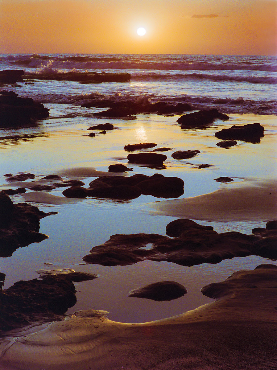
Sad to say, I had some serious disappointments with the 35mm images taken between 1985 and around 2000. The film that Kodak gave me— mostly Kodacolor Gold 100 or 200 (negative film)— had nice colors and tones and looked good in 4×6 inch snapshots, but it fell apart when enlarged beyond 8×12 inches. It was grainy and had poor sharpness (MTF; what we measure at Imatest). It couldn’t compare with my B&W negatives from the 1970s (Ilford FP4 film) or with Kodak’s flagship product, Kodachrome transparency film (which was slower but phenomenally fine: looked great projected, but its high contrast made it difficult to print). All but two of the images on this page were taken with 35mm cameras, and most don’t look good printed larger than about 8.5×12 inches, and won’t be in my upcoming photo show.
I will make prints with borders, eliminating the need for overmats, and mount them with 1/4 inch Econospace spacers in Nielsen 117 frames. Total frame sizes will be 24×32, 18×24, and 14×18 inches. I may print a few larger ones later if there is a need, but they’re difficult to handle and require scarce space.
Medium format images
These two images are medium format, taken with Rolleiflex or Hasselblad cameras in the late 1970s or early 1980s. They look beautiful printed.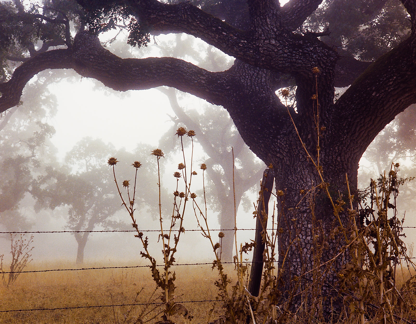
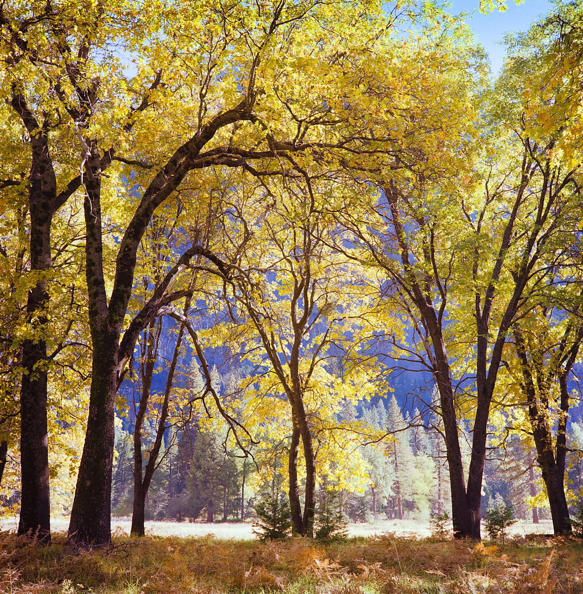
This may be the Yosemite image I dreamed of taking while I was admiring Ansel Adams’ outstanding photographs at the George Eastman house (about a mile from my childhood home). I love the detail, symmetry, and rhythm. But I forgot it after I took it, and the negative sat in a box for over 45 years.
35mm images
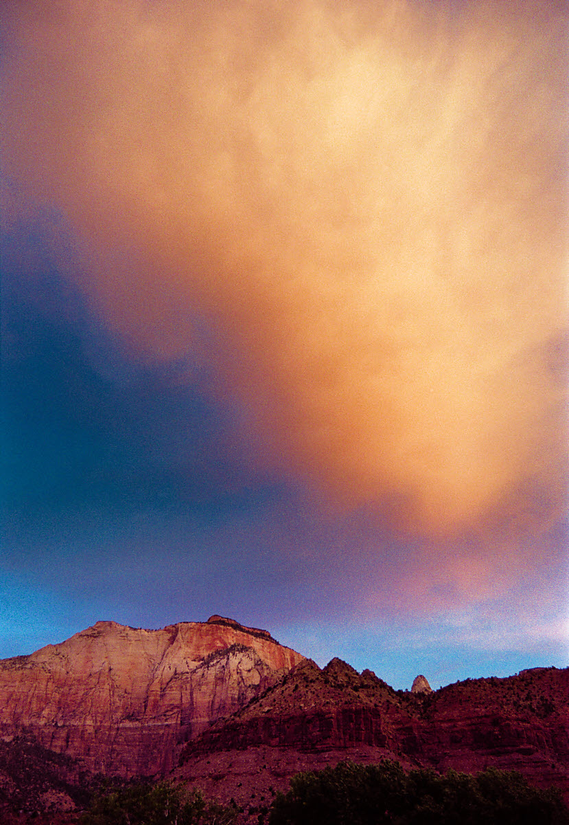
Most of these aren’t good enough to print 12.5×17 inches (total size 18×24 inches with borders).
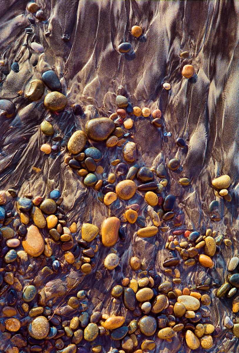
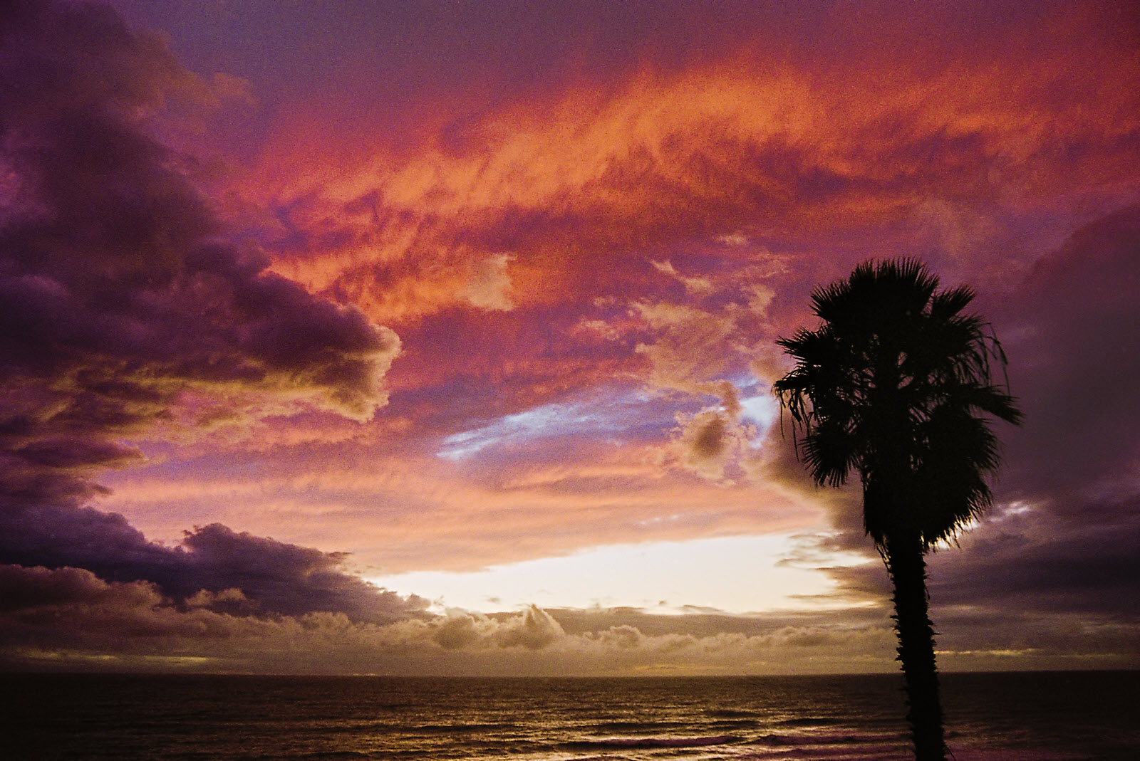 A Southern California cliché, but I couldn’t resist.
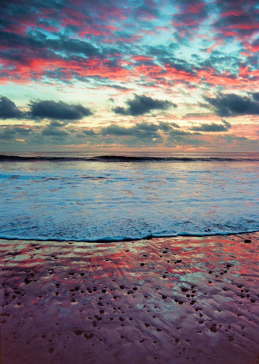 For me, this is more of an abstraction than a simple seascape.
 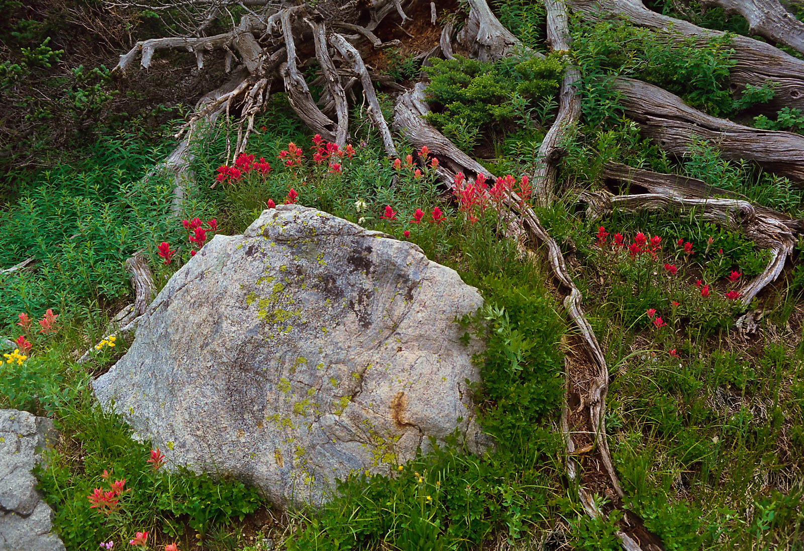 Taken on the Arapahoe Glacier trail, just before the timberline. This image is less sharp than Id like, but it will look OK printed small. I want back to that location many times, and on one occasion got a comparable image (but with fewer Indian paintbrushes), shown below (the only digitally-acquired image on this page)
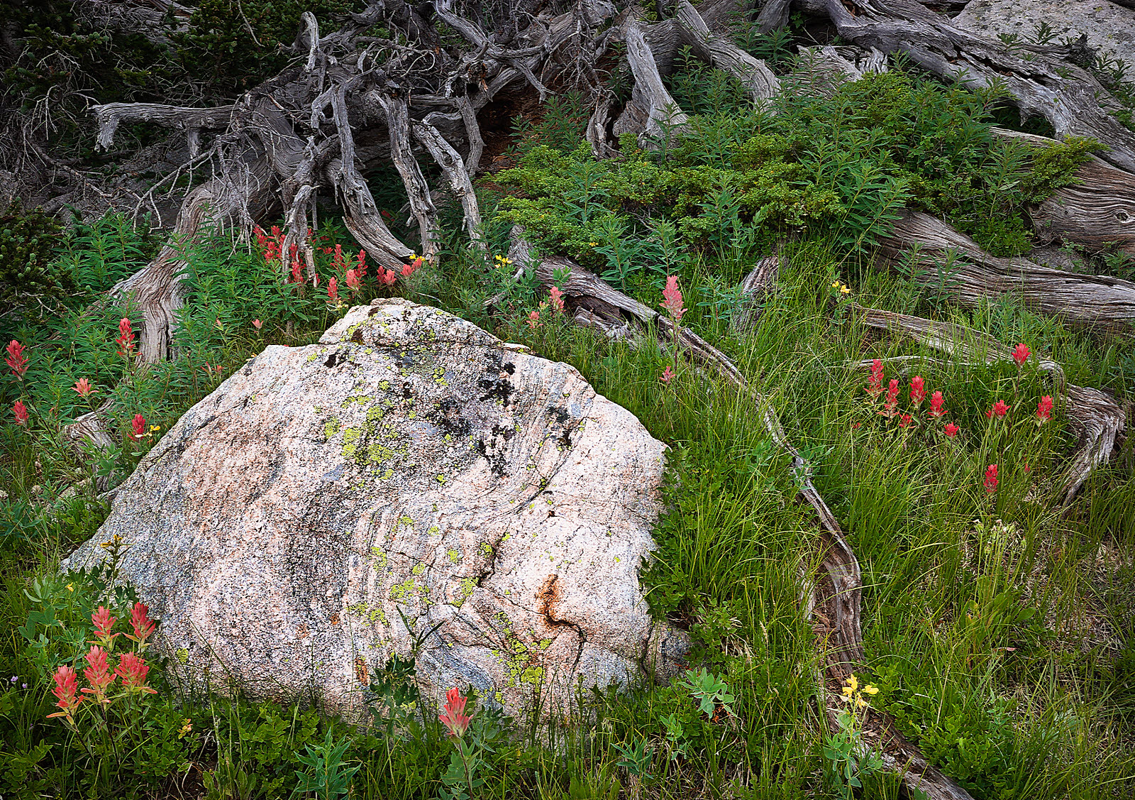 (the only digitally-acquired image on this page)
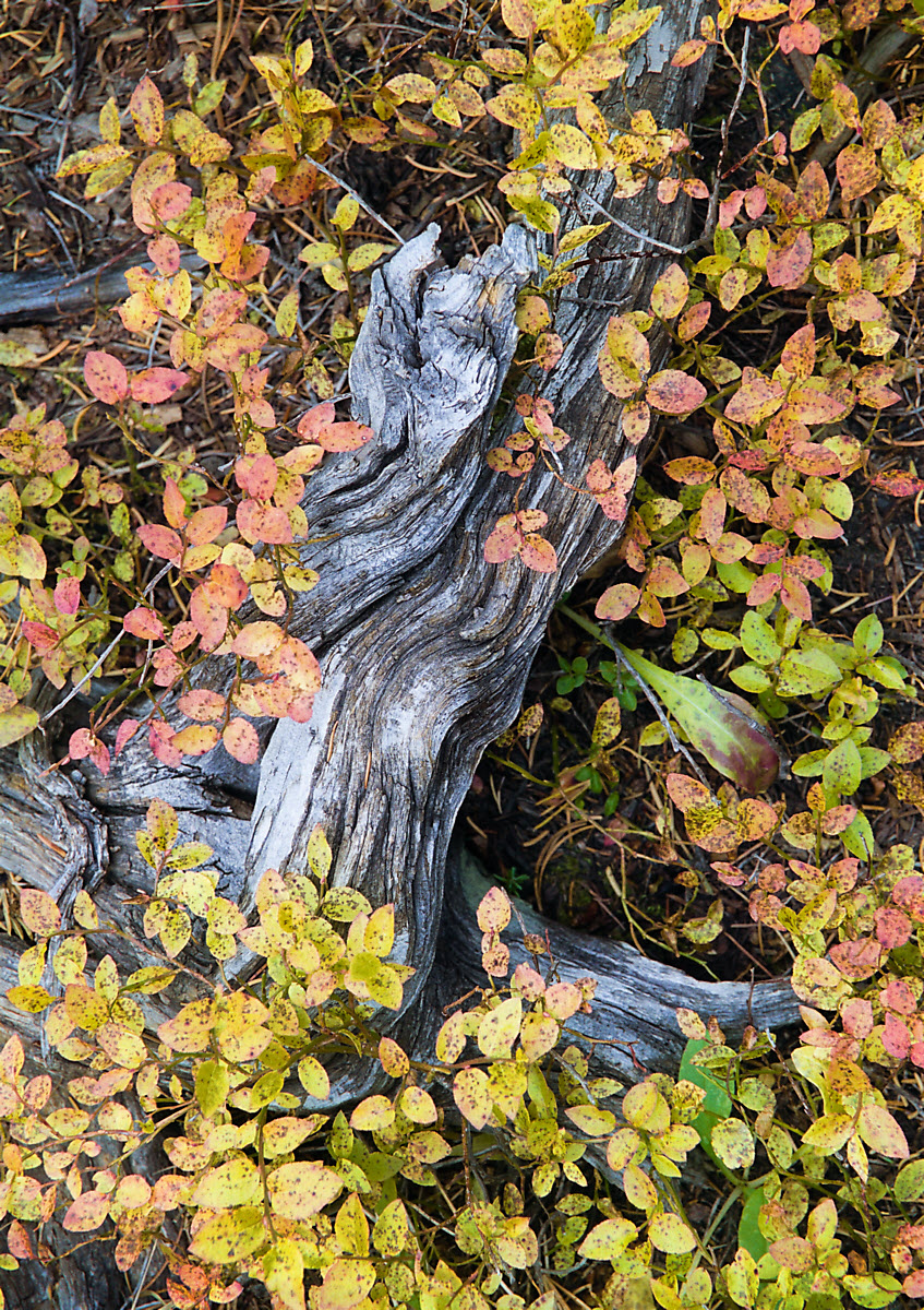
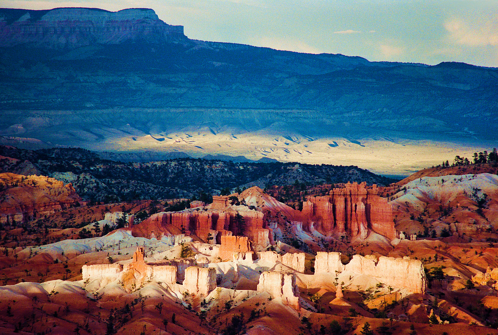 For me, this image, taken in Bryce Canyon, evokes an imaginary Tibetan monastery. Many of my images (on related pages) evoke something, often mysterious, other than what they are:, for example, rocks that evoke planets, mountains, or nature spirits.
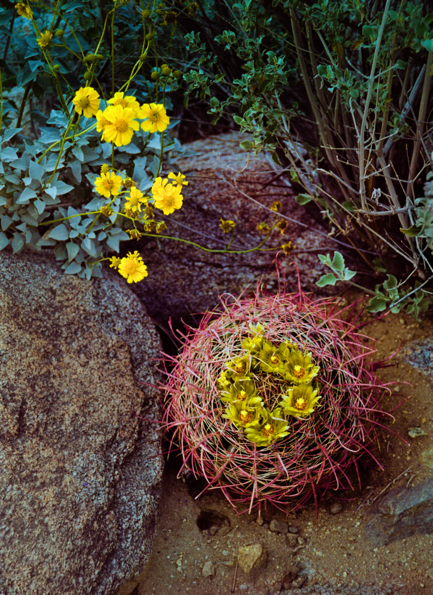
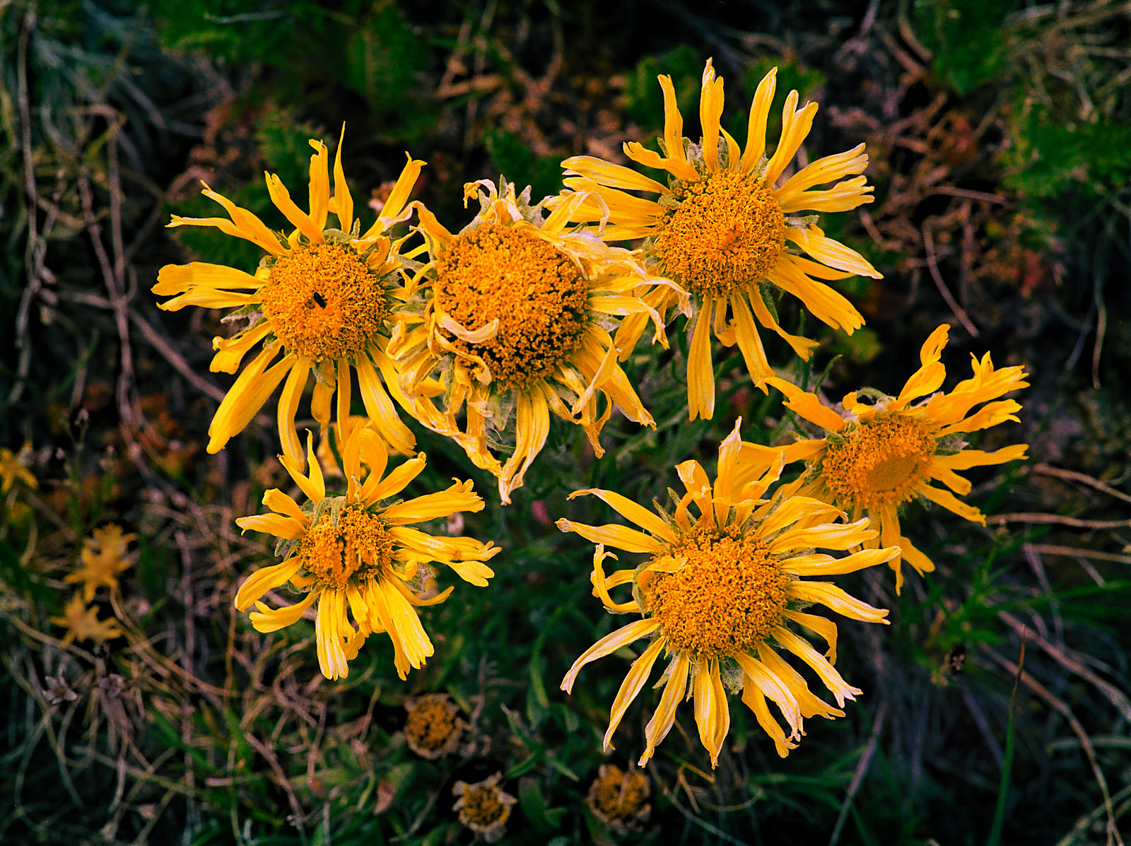
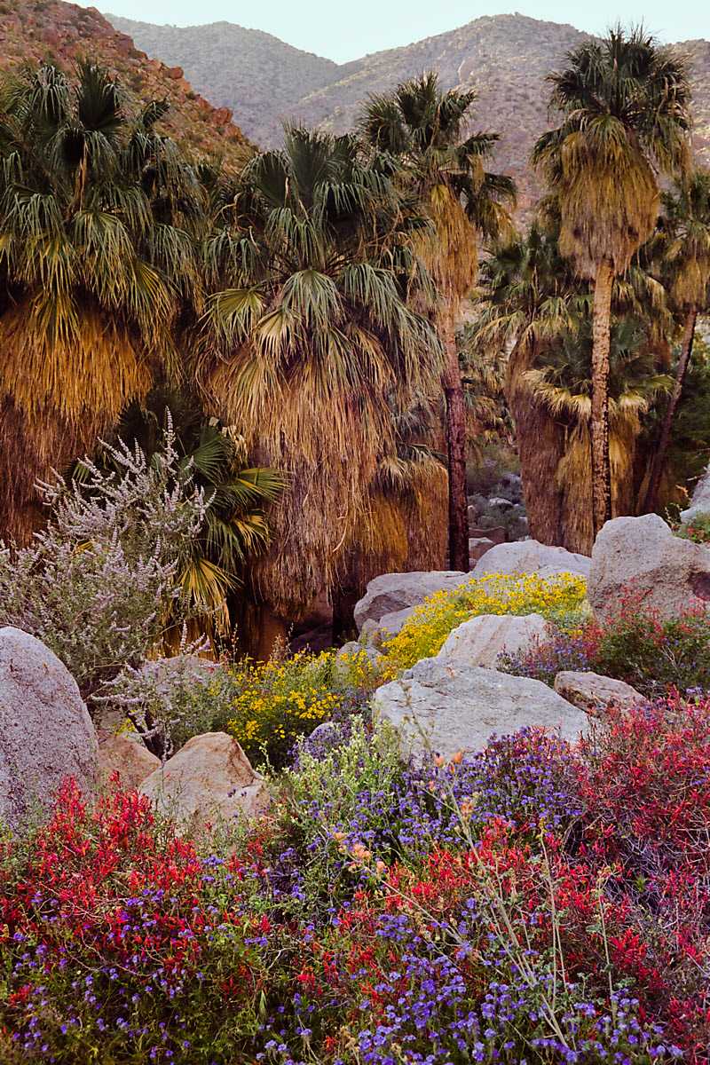 This was an extremely rare bloom in the Anza-Borrego desert, east of San Diego.
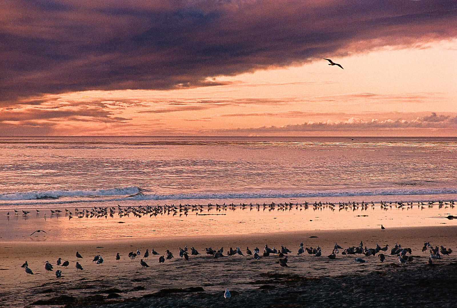
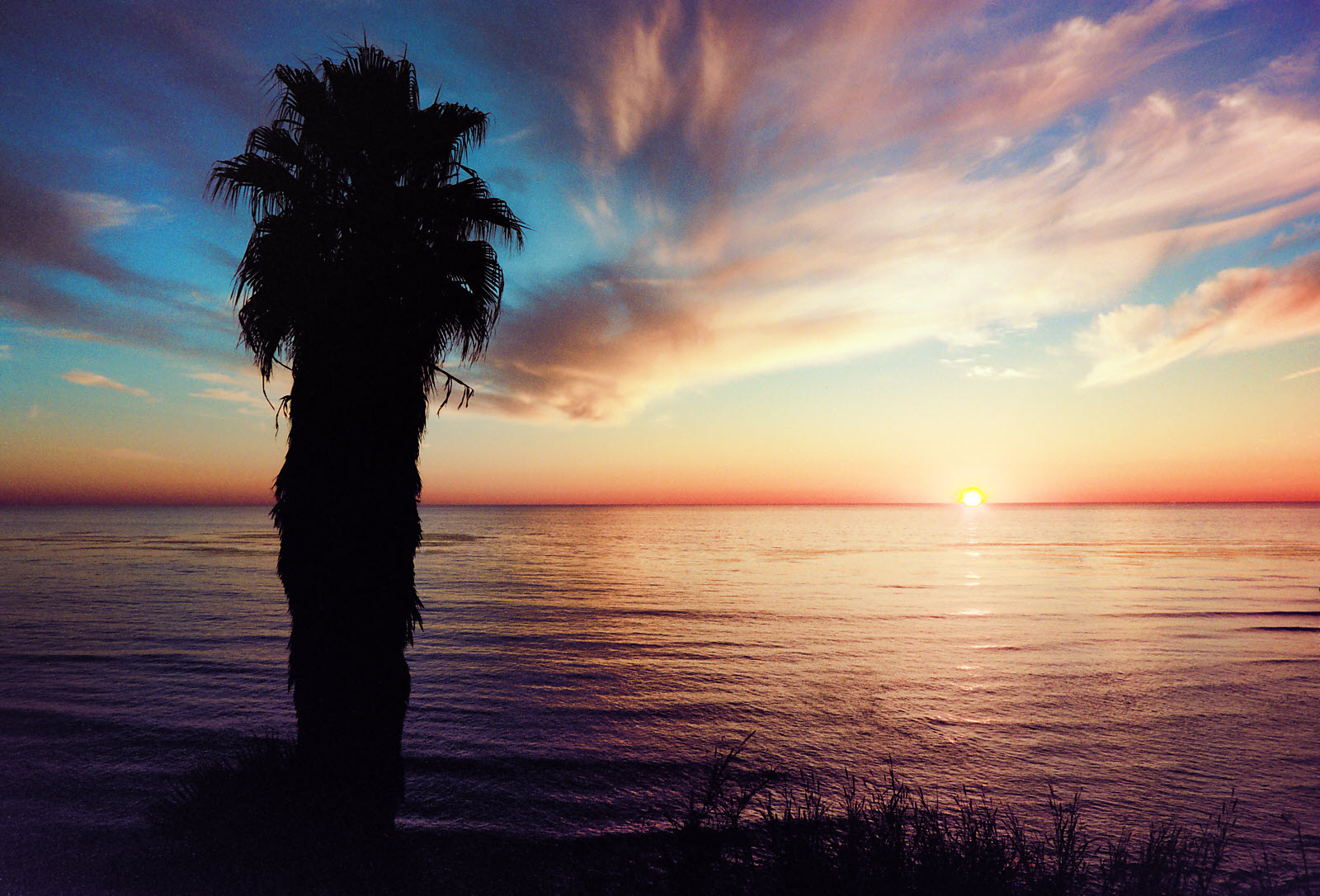
 This image was printed small (7×10 inch active area), but I rescanned it after I decided it deserved better.