Point Lobos/Big Sur workshop
January 25, 2004
by Norman Koren
|
|
|
I conducted an informal workshop in Point Lobos and Big Sur on Sunday, January 25, 2004-- hopefully the first of many. The workshop and itinerary was planned by Subrata Guhamajumdar. There were four additional participants: Manju Shekar, Beth Rounsevell, Fran Dugan, and Animesh Mahapatra. Two spouses also joined us. It may have been a little too informal; next time I'll be better organized. I'll make sure I look at prints and I'll do a critique if the participants want one. I'll also show my own prints, which I should have done at lunch. I enjoyed the company so much I got forgetful.
The best light of the day was when the clouds were clearing over the green oak-studded hills between Gilroy and Watsonville, while we were hauling down Highway 101 to reach Point Lobos, where we were to meet the other participants. It had rained the day before. Oh well, c'est la vie...
We spent the morning at Point Lobos, just south of Carmel. By the time we arrived (about 9:15 AM, just 15 minutes after Point Lobos opens), the skies were mostly clear. At noon we headed for a leisurely lunch at Nepenthe-- a wonderful restaurant in the heart of Big Sur, about thirty miles to the south of Carmel. It's overpriced by normal standards ($11 to $15 for a sandwich with a generous side salad), but there's nothing normal about this magical spot. And the food is excellent.
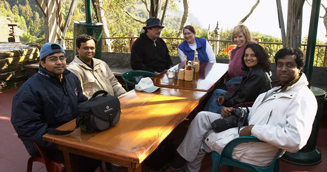
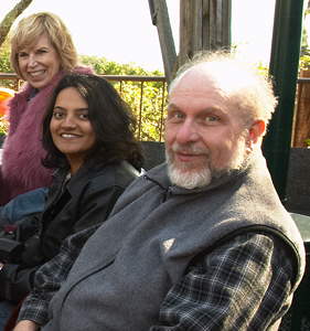
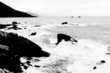
Above: Workshop participants (L to R): Animesh, Subrata, Dan (Beth's husband), Beth, Fran, Vidya (Manju's wife), Manju.Afterwards we drove back north to Garrapata State Park. to photograph Garrapata Beach. I got into an argument with Subrata's GPS. It knew the location of the park, but not the beach. You can't reason with a GPS, but you can choose to ignore it. We stopped first at the north end of the park, where the GPS directed us. The image below was taken there. Later we drove to the location where I remembered the beach-- it's not marked clearly, but there are cars parked along side the road. It's marked on the PDF park brochure. It's located just north of Morley Baer's landmark stone house, which I visited in the 1970s. Morley was an outstanding architectural photographer-- a friend of the Westons and Ansel Adams. He built his house in the good ol' days when Big Sur was an undesirable, remote, foggy place, too far for comfort from chi-chi Carmel. His work is represented by Photography West Gallery. |
 |
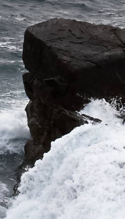
The image below was taken at 4:34 PM-- about an hour before sunset; it had gotten pretty gray. The image was captured on the EOS-10D with the 17-40 mm lens set to 27 mm, 1/180 sec, f/9.5, +0.5 exposure compensation (the exposure setting was being influenced by the white foam). Here is the scene, as converted from RAW with Capture One LE. I applied a slight curve and increased saturation moderately (11.5%).
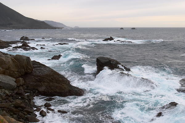
I spend a lot of time scouting sites, usually in imperfect light, to find spots to head for when it seems like the light might be good. The best light-- a mixture of sun and clouds-- is never a sure thing.
Like a musician, a photographer has to practice, even though our art is not as demanding at that of the musician. We take pictures, even in less than ideal circumstances, to hone our eye, to prepare us for the moment when light and landscape combine to make magic.
A second look at the image made me realize that it might have some promise. Many of the finest images are taken in gray light-- in overcast or fog. Although flat light can decrease image contrast, they can increase scene contrast-- the contrast between elements in the scene-- foreground and background, trees and sky, rocks and waves. It's easy enough to increase image contrast-- it can be done with no tonal loss for an image captured RAW and processed in 48-bit format. Ansel Adams did it by developing film longer than normal. He called it N+1, N+2, ... in his zone system. Beth Rounsevell's image, below, is an example of how to deal with high image image and low scene contrast. It's a bit paradoxical, but no big mystery once you figure it out.
Virtually all the classic images by the great straight (so-called) landscape photographers-- Ansel Adams, Edward Weston, Paul Strand (perhaps the greatest of them all), and Walker Evans, to name a few, are highly manipulated-- dodged and burned. Ansel Adams would do anything to get an image right-- including water bath development, bleaching-- you name it. He would have loved digital editing.
There are several reasons for dodging, burning, and other manipulations. The eye works differently when viewing a natural scene and a print-- it adapts to changing light in a scene but not in a print. The artist-- painter or photographer-- makes that adaptation through dodging and burning. Unless you have perfect studio lighting, some areas need to be emphasized or de-emphasized. The purpose of a work of art is not to document reality; it is to convey an experience.
My first thought was that the sky was too light. So I made a mask (left, below) to darken it. Then I decided that the dark rocks and the mountain on the upper left were too flat. So I made a contrast mask (right, below) using the technique presented in Contrast masking with Picture Window Pro to boost the contrast in the rocks (the dark areas)-- to darken the shadows and boost the highlights.
 |
 |
| Next I made a mask with very blurred edges to boost contrast around
the center of the image-- to lighten the foam. Then I decided to darken
the sky more. I made another mask, centered at the horizon, but much fuzzier
than the first (above, left). I finally got it the way I wanted it, with
the mountain on the left quite dark-- between zones 2 and 3 (using Zone
system terminology). The foam is quite bright, but not washed out.
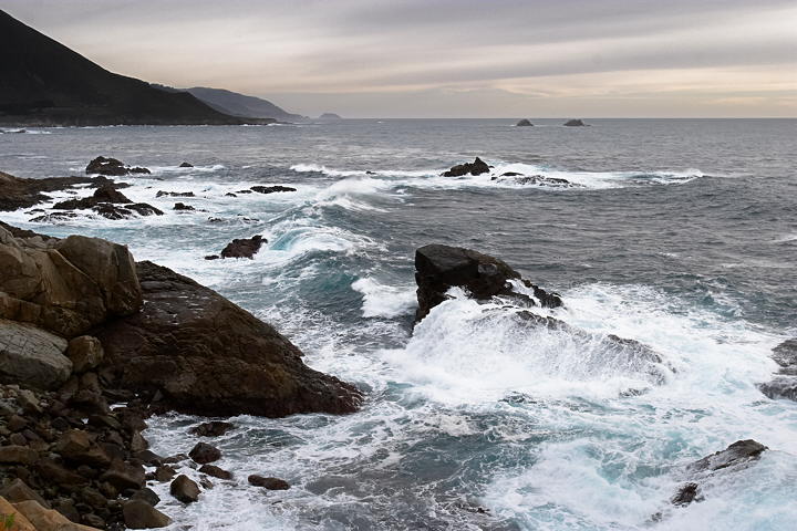
I'm pleased with the result-- it's better than I expected when I made the exposure. It glows, but not so much that it appears artificial. It's better than most album covers for Claude Debussy's La Mer in my collection. In my wildest imagination it might even capture the feeling Homer intended to convey with the words, "wine dark sea." But that might be taking it a bit far-- wishful. The key to successful editing is to make repeated small adjustment until the image comes to life.The image is quite sharp-- it makes a splendid 13x19 inch print. A 1:1 crop (1 screen pixel per image pixel) is shown on the right. At a typical monitor resolution of 85 pixels per inch (the oft quoted number, 72, is bogus), a 2048x3072 pixel image of the same magnification would be 24x36 inches. That's about twice the magnification (four times the area) of a 13x19 print-- as large as my Epson 2200 will go. |
 |
Beth asked about the level I was using. It's described on https://www.normankoren.com/phototechnique2.html#Level.
 |
I've taken the liberty of reproducing a small version of Beth's Point
Lobos image. A larger
version is on her website. She made good use of diagonals on the tree
on the left. I missed them.
Beth's image is a good illustration of how to deal with a difficult problem in bright sunlight: high image contrast and low scene contrast. It was made around 11 AM. Since it was January, the sun wasn't as high as in summer, but it was high enough. The problem is that the tree on the left has bright highlights and deep shadows on its branches. The cliff in the background has equally bright highlights and deep shadows; its features are also the same size as the branches. The ocean has slightly brighter highlights (the foam) and deep blues in the water. If the cliff had been used as the background for the tree, it would have been total visual chaos. Even though individual image elements are very contrasty, scene contrast-- the contrast between the visual elements-- is low. Beth was able to establish some scene contrast by using the smooth middle-toned sky as the background for the tree. Scene contrast is high when the foreground is in the sun and the background is in shade, or vice-versa. It's low when the foreground and background have the same range of tones, even if both are very contrasty-- as they are on the tree and cliff. It's extremely difficult to get a good image when scene contrast is low. It is often higher when the sun is low-- in the "golden hour." When you see an object that interests you, make sure it contrasts with its background. The relationship is all-important. You'll rarely make the image you visualized if scene contrast is low. |
I had great fun with the workshop; I'd like to do more. I'll be back in the Bay Area around Memorial Day weekend for my mother-in-law's 90th birthday (a big one!) May 31. Unfortunately a holiday weekend is an awkward time to schedule a workshop. Afterwards we'll be traveling to the Northwest-- to Portland (where my son Nathan lives), Seattle, and beyond. If you'd like to help organize a workshop in your area, please get in touch.

| Images and text copyright (C) 2000-2013 by Norman Koren. Norman Koren lives in Boulder, Colorado, where he worked in developing magnetic recording technology for high capacity data storage systems until 2001. Since 2003 most of his time has been devoted to the development of Imatest. He has been involved with photography since 1964. |  |